PortfolioUIUX Design
Game Interface APP
Project Summary
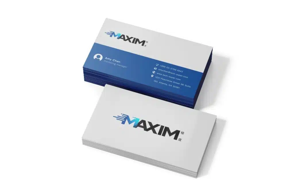
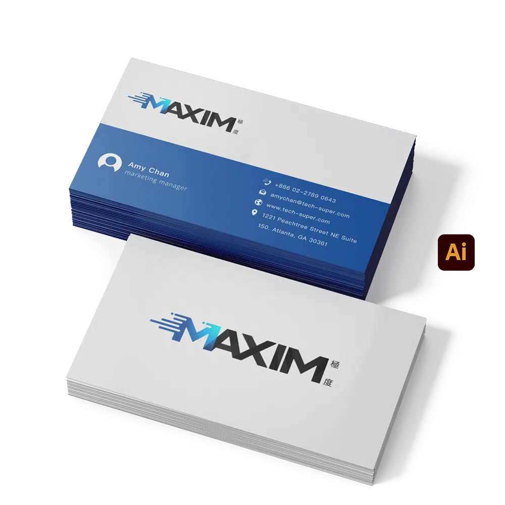
- Client Requirement: Brand logo design with a strong emphasis on speed and a technological aesthetic.
- Client Name: KING BAY TECH
- Project Scope: Logo Design
- Production Tools: Adobe Illustrator
- Note: According to the client, the game is licensed and released only in jurisdictions where gaming is legal. This project was produced as a contract development assignment, and the additional requirements were approved by the client.
Design Concept
Version M:
In this logo design, the letter “M” is formed using dynamic lines that convey a strong sense of speed. It represents the core element of the brand name MAXIM, symbolizing the brand’s pursuit of excellence and an ultimate experience. At the same time, the flowing motion of the lines highlights the efficiency and smoothness of the brand’s services.Version X:
This version uses a geometric “X” form, integrating visual elements that convey speed and motion. It follows the same design philosophy as the M version, symbolizing the idea of breaking boundaries and achieving ultimate efficiency. The design further emphasizes the brand’s technological character and innovative spirit.
Color Design:
- Technology Blue: Symbolizes the brand’s innovation and forward-looking vision, conveying a sense of professionalism and trust.
- Dark Charcoal Gray: Enhances the logo’s sense of stability and reliability while highlighting the technological qualities of the blue color.
The overall design uses a clean and powerful graphic language to express the brand’s sense of speed and technological sophistication. This approach creates a distinctive visual impact while strengthening the memorability of the brand image.