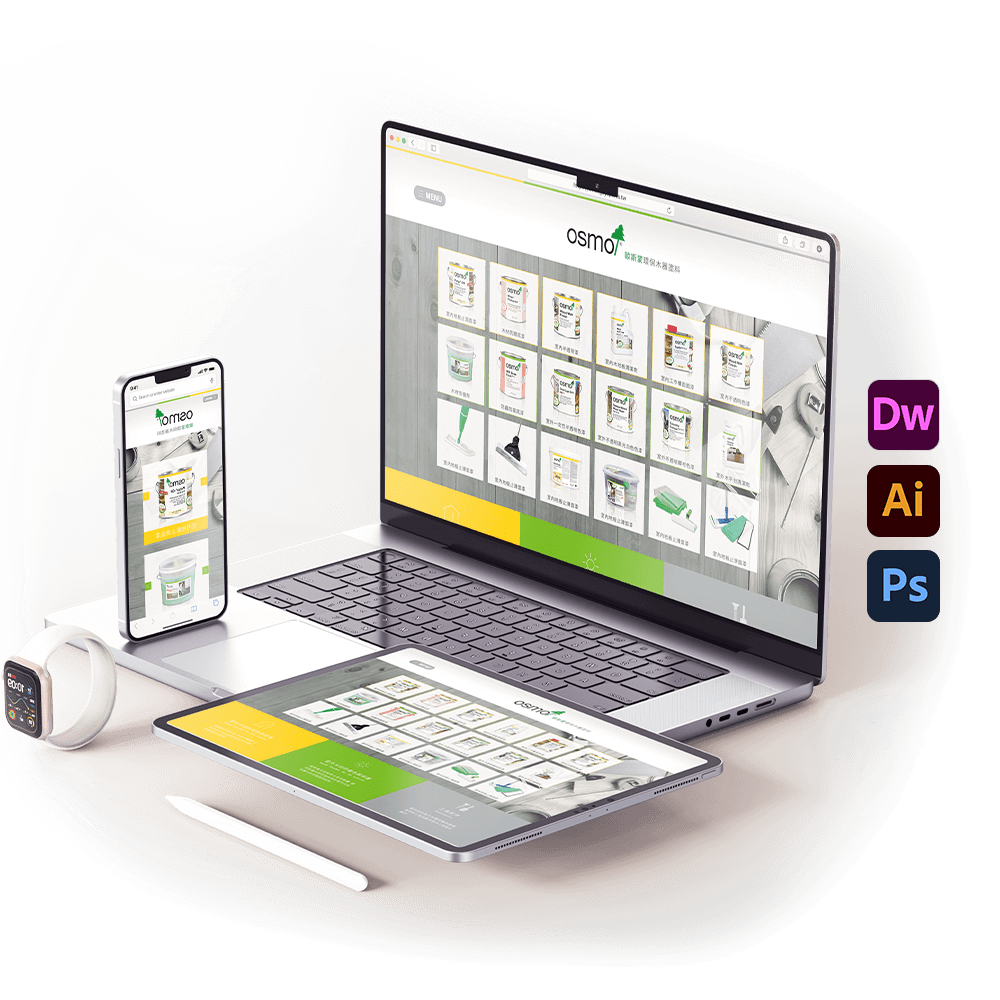
PortfolioOfficial Website
Web UI、Bootstrap
Project Summary
- Client Request: Design the official website for Germany’s OSMO with sustainability as the core theme, featuring a clean, elegant, and modern aesthetic.
- Client: CENTRAL TRILLION Technology
- Deliverables: Official website UI design and HTML development
- Tools & Tech: Dreamweaver, Illustrator, Photoshop, and the Bootstrap framework
- Note: This project was successfully approved by the client.
Design Concept:
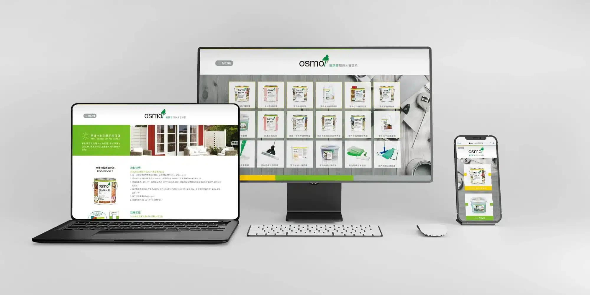
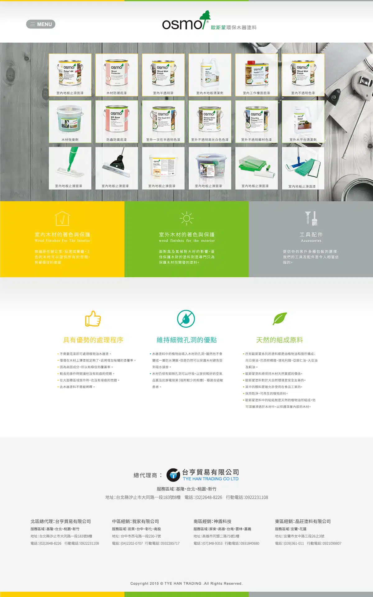
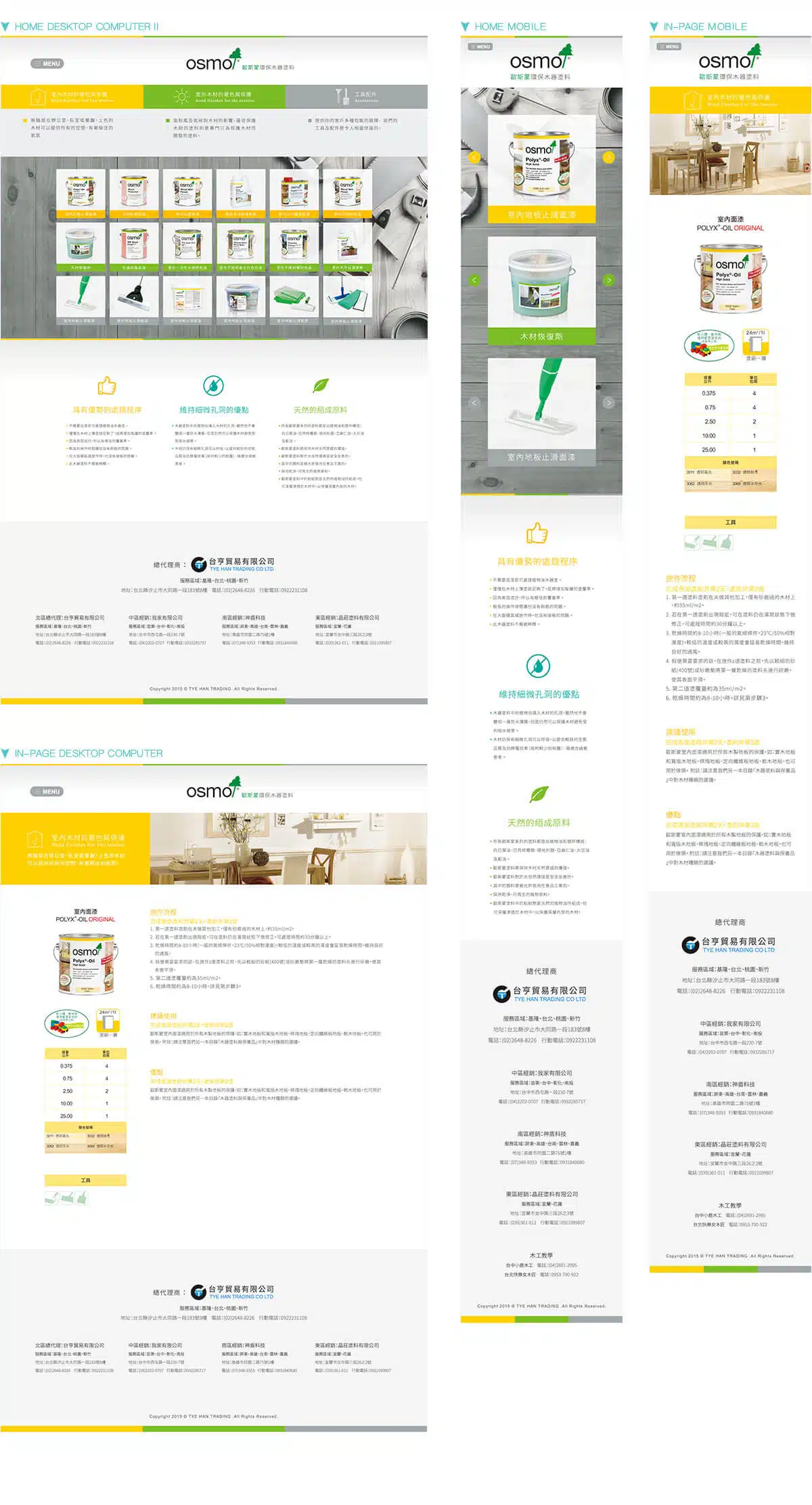
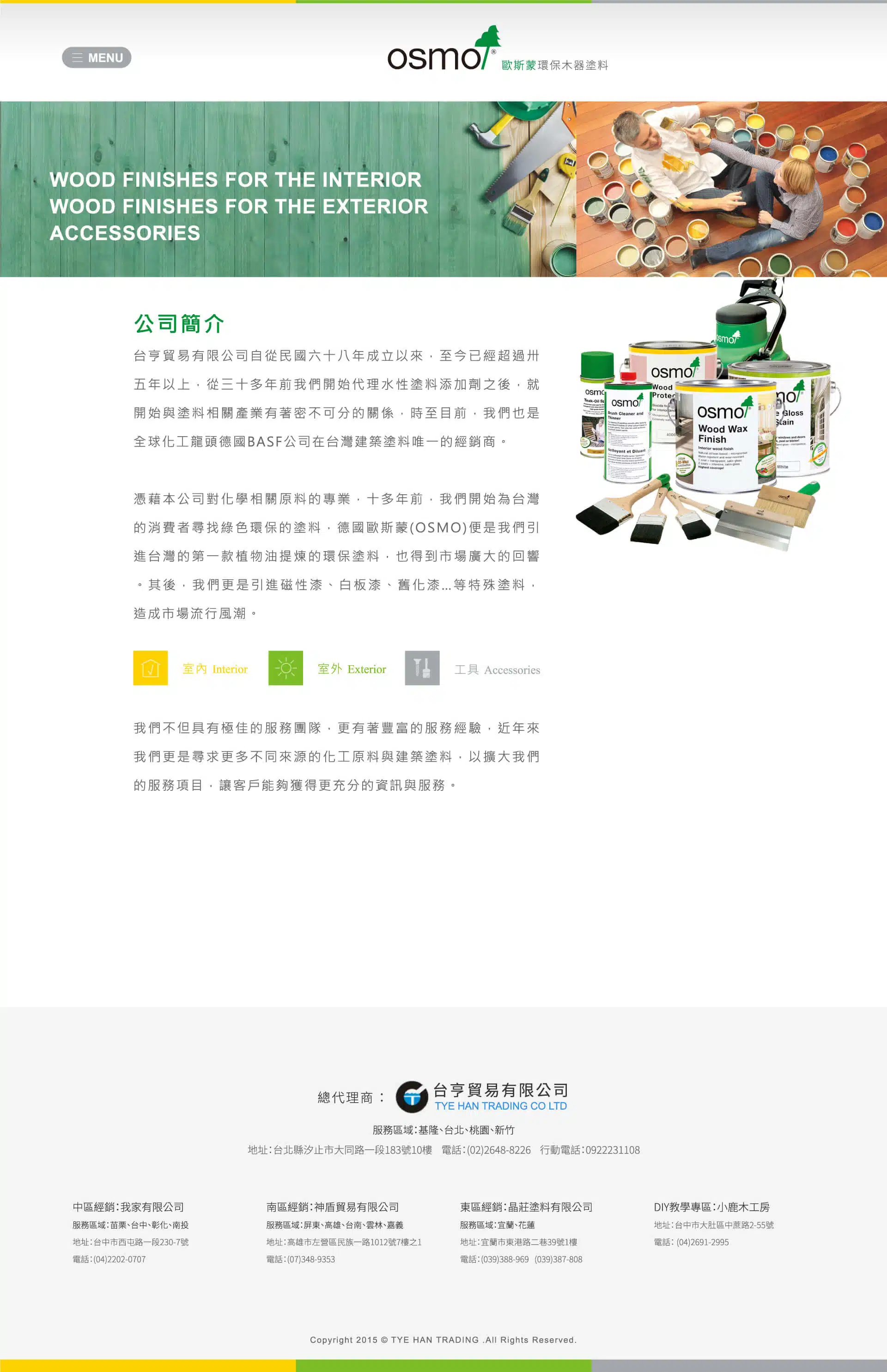
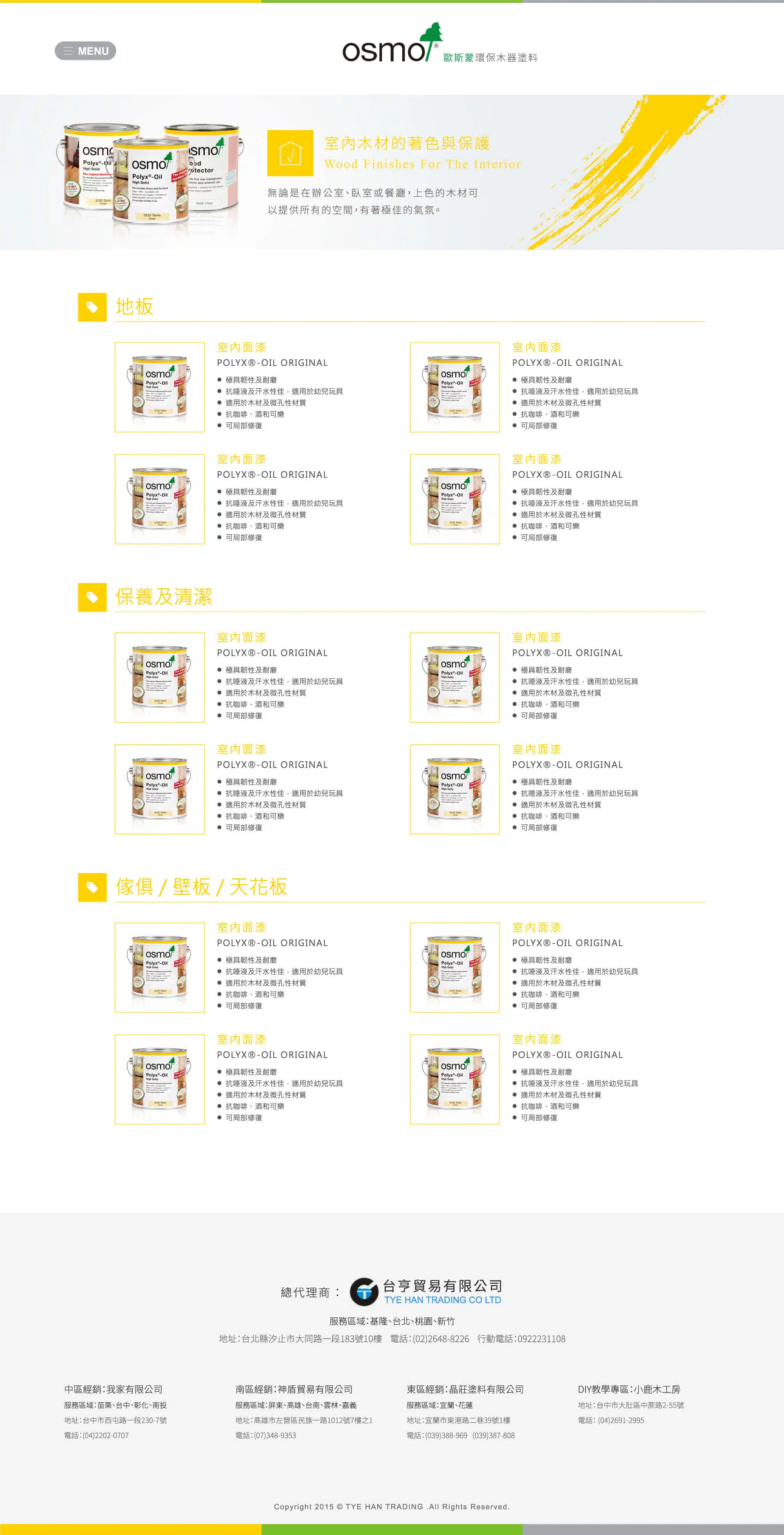
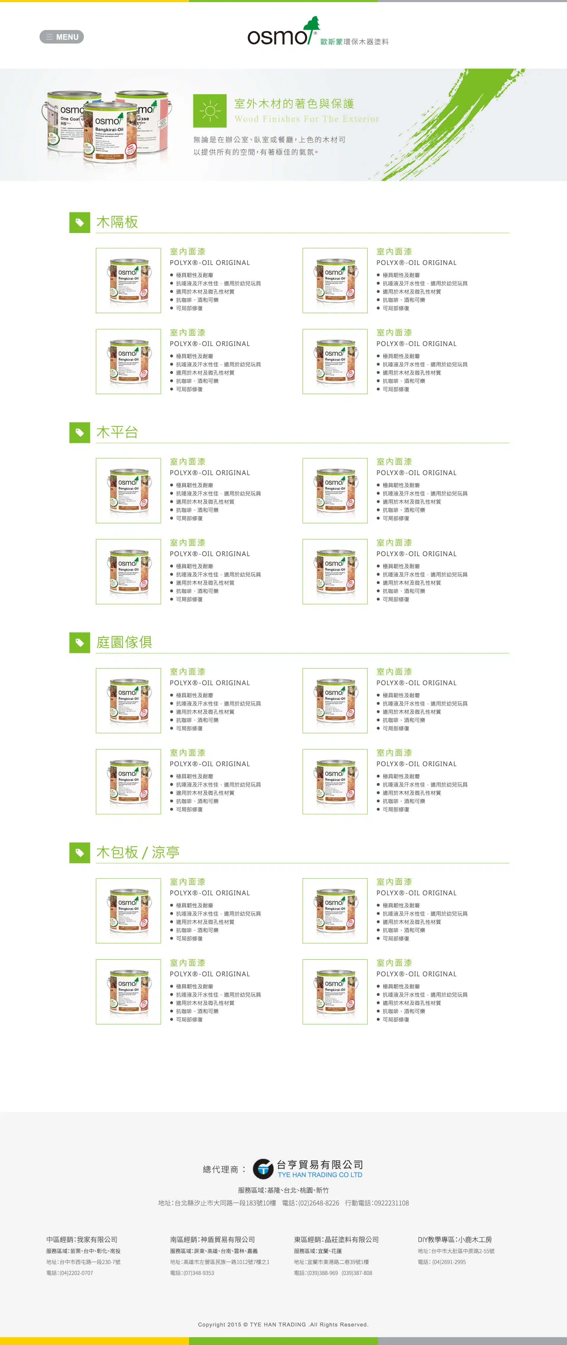
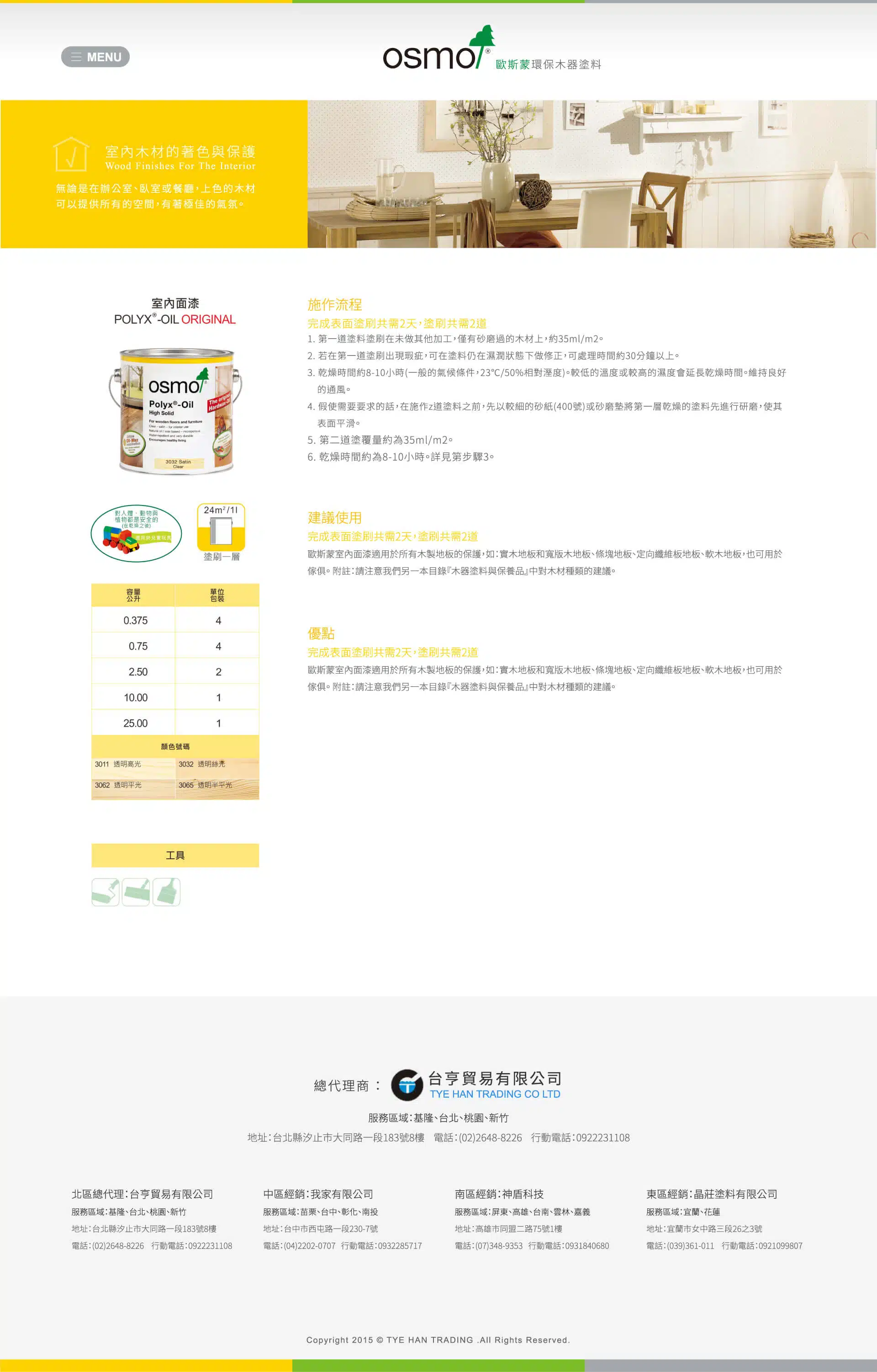
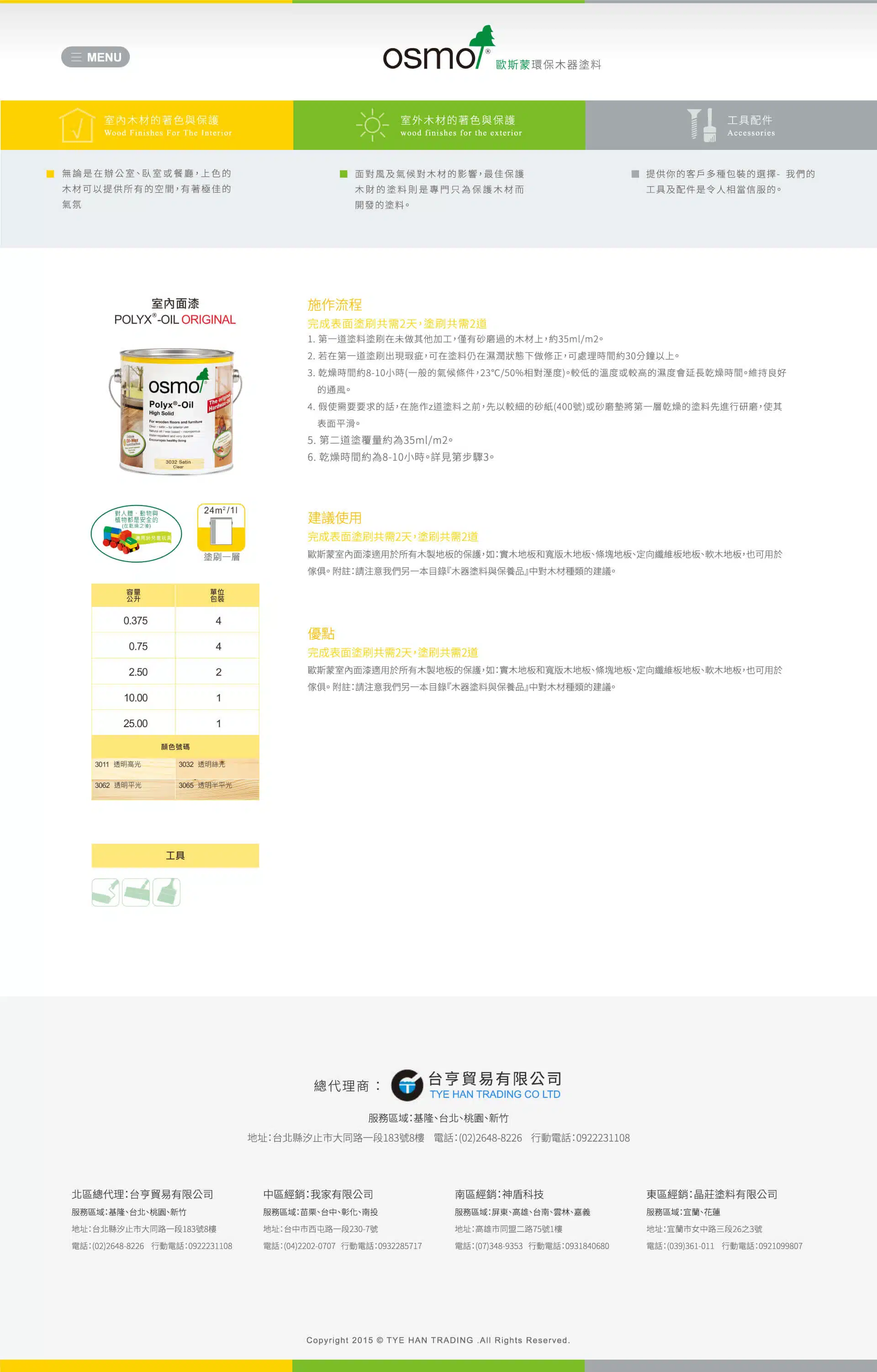
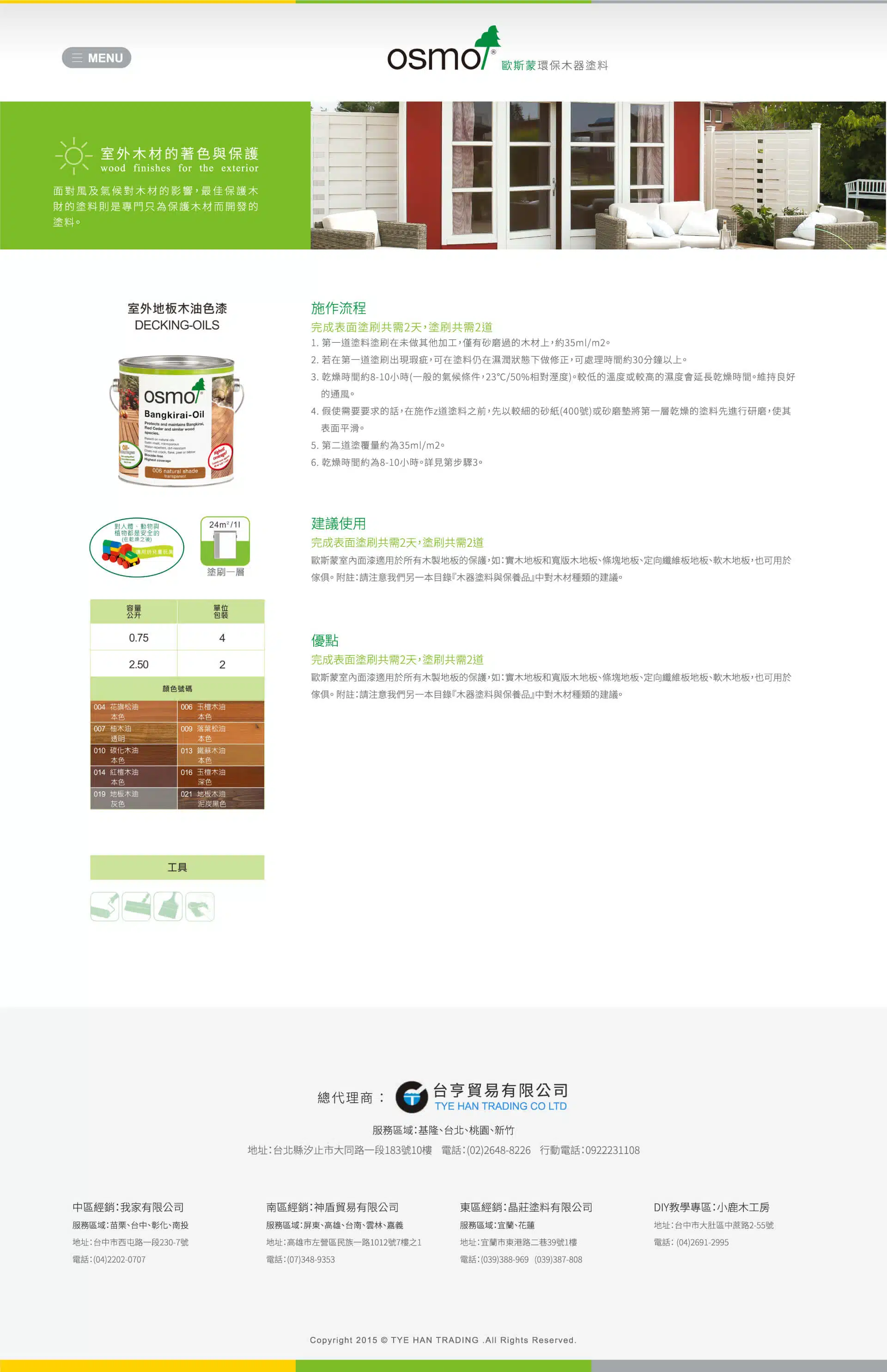
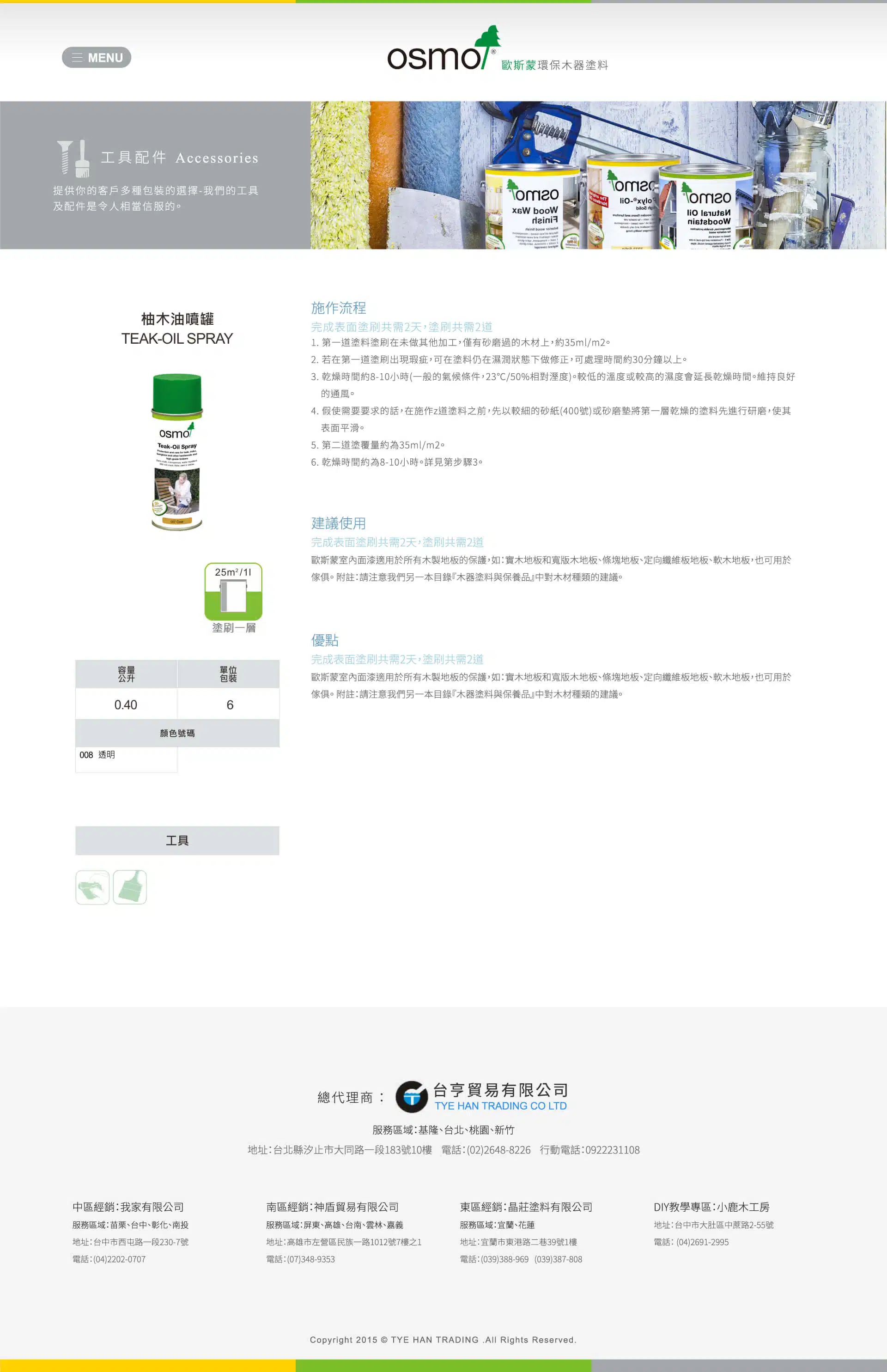
The official website for Osmo Germany, a specialist in eco-friendly wood finishes, centers on a clean, refined, and modern visual approach. Through thoughtful color and layout choices, the design communicates professionalism and a strong connection to nature. Vibrant ochre yellow, fresh teal, and balanced gray tones are paired with light gray and white backgrounds to create a bright, airy aesthetic that highlights the brand’s core products and competitive strengths.
[ Color Strategy ]
Vibrant Ochre Yellow: Represents the coloring and protection of interior wood, conveying warmth and vitality while enhancing the comfort and aesthetic appeal of living spaces.
Vibrant Teal: Represents the coloring and protection of outdoor wood, evoking a strong connection to nature while highlighting the product’s durability and protective performance.
Medium Gray: Used for tools and accessories, emphasizing professionalism and practicality. It balances the vibrant primary colors, adding depth and a modern edge to the overall visual identity.
[ Structure & Experience ]
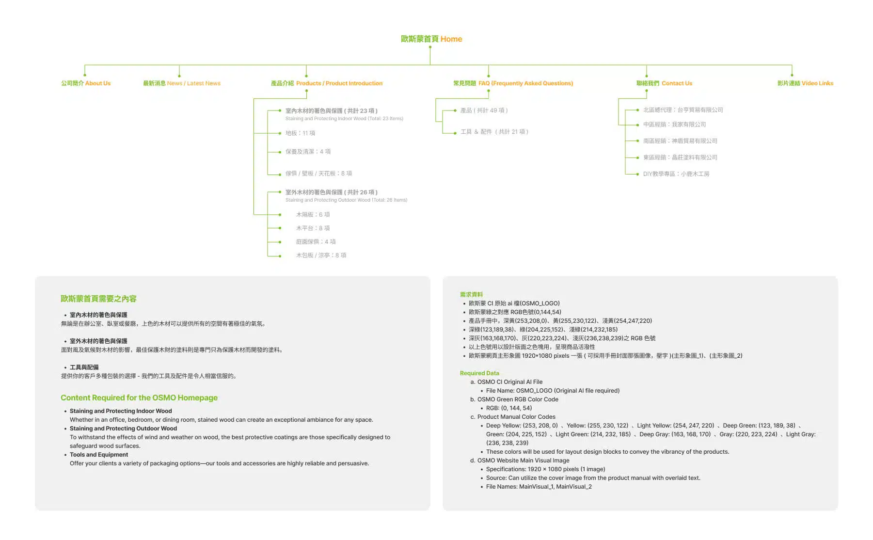
The website is organized around three primary product categories, clearly presenting functions and application scenarios. Clean typography and an intuitive interface allow visitors to quickly locate the information they need. Generous use of white and light gray backgrounds creates a crisp, spacious feel, while strategic accents of brand colors enhance recognition and highlight key product features.
[ Brand Value & Core Message ]
The website design centers on Osmo’s three core strengths: advanced application performance, breathable microporous properties, and natural raw materials. Visual elements and copy work together to communicate the brand’s commitment to environmental responsibility, sustainability, and uncompromising quality.
This design not only reinforces the brand’s professional image, but also blends modern and natural elements to create a fresh, comfortable, and trustworthy visual experience.