PortfolioOfficial Website
Web UI、Bootstrap
WEB
Project Summary
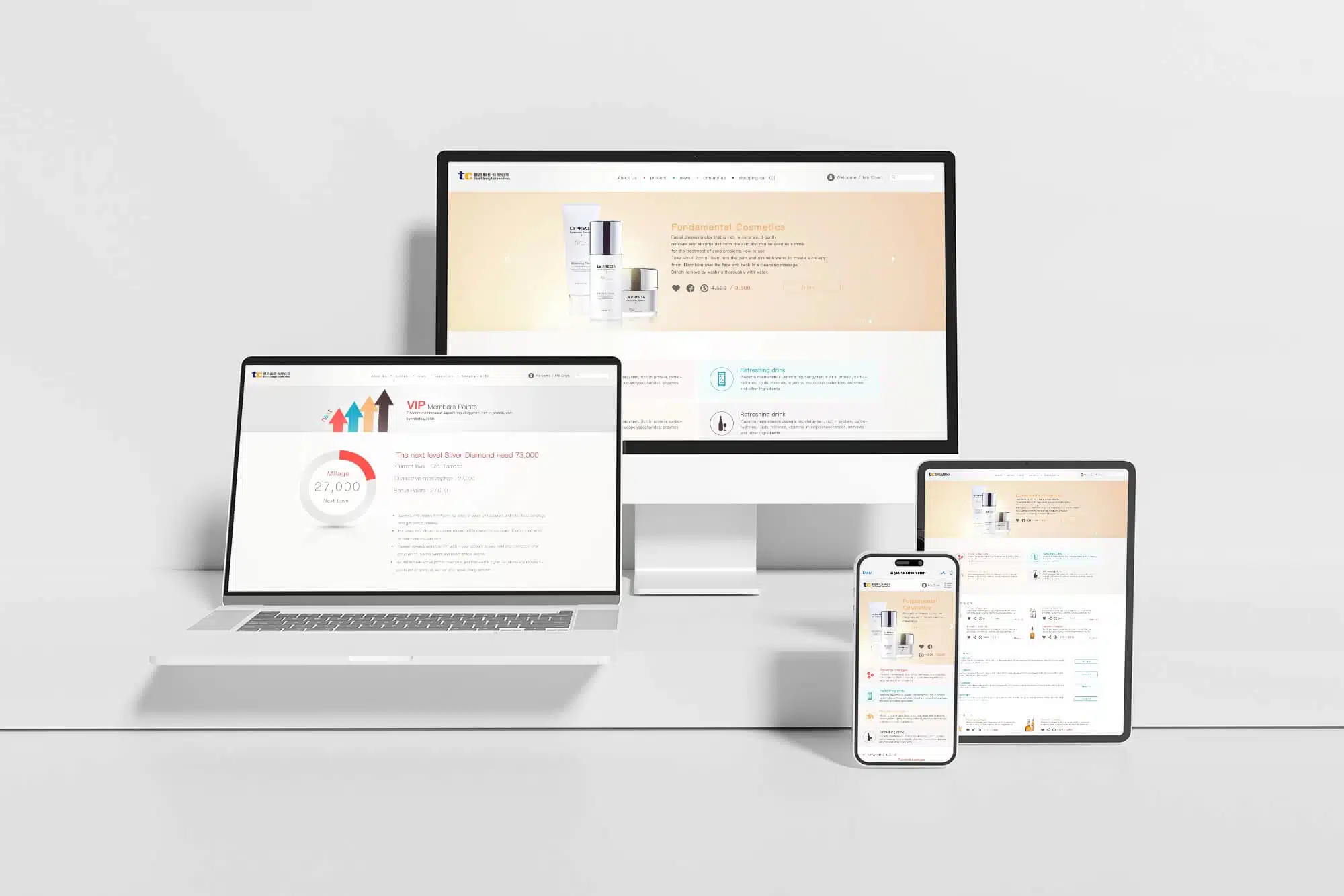
- Client Request: Design an official website for Hsin Chang Trading with a clean, minimalist aesthetic and a bright, refreshing visual style.
- Client: CENTRAL TRILLION Technology
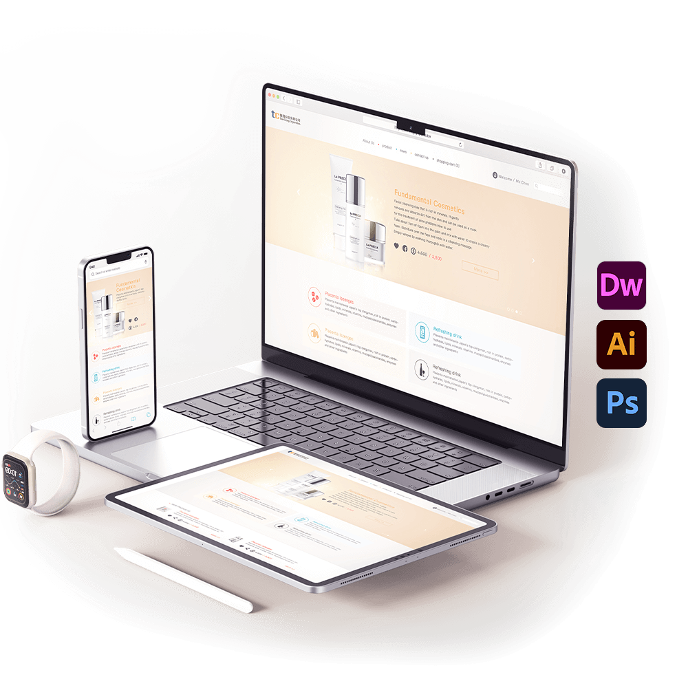
- Deliverables: Official website UI design and HTML development
- Tools & Technologies: Dreamweaver, Illustrator, Photoshop, and Bootstrap
- Note: This project was successfully approved by the client.
Design Concept:
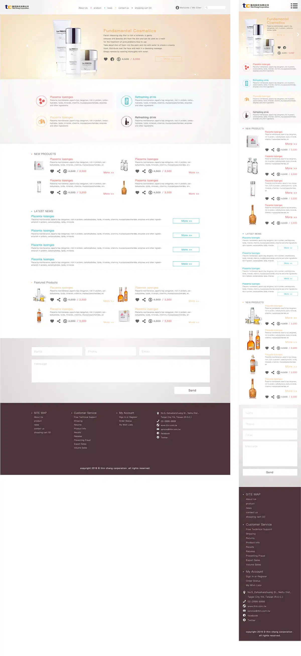
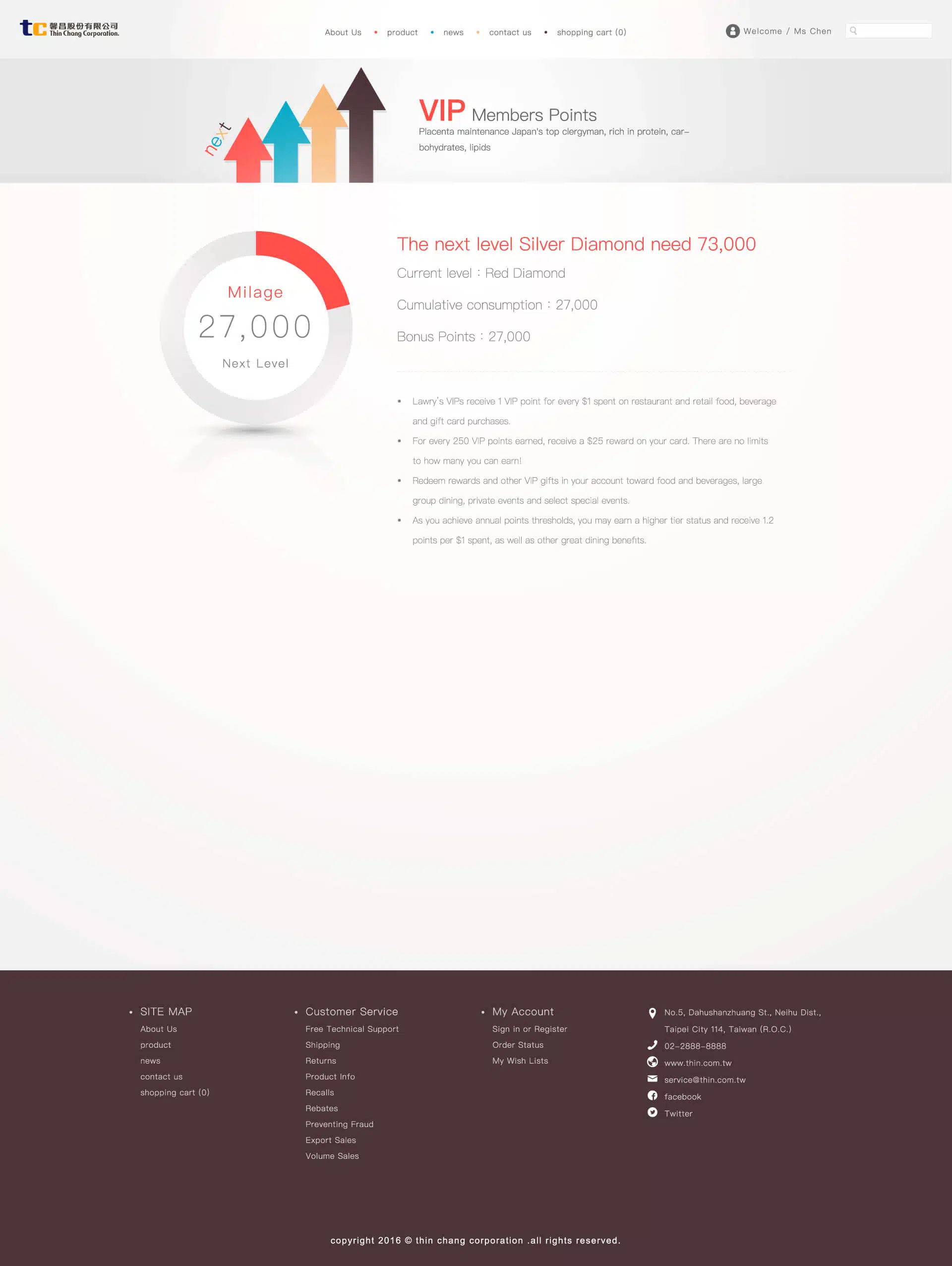
As a trading company representing Japanese skincare and premium beverages, thin-chan primarily targets a female audience. To align with its brand positioning, the website UI adopts soft, feminine tones, creating a gentle and refined visual atmosphere.
The overall design applies four distinct color systems to represent four product categories. Through soft, fresh, light, and luminous tones, each category is visually differentiated while maintaining harmony and balance. This design language reflects the product characteristics and strengthens consumer trust and brand affinity.