PortfolioUIUX Design
Game Interface APP
Project Summary
- Client Requirement: Create a design based on a minimalist style.
- Client Name: KING BAY TECH
- Project Scope: Game UI/UX Design
- Tools & Technologies: Sketch, Zeplin, Illustrator, Photoshop, DragonBones
- Note: According to the client, the game is licensed and released only in jurisdictions where gaming is legal. This project was produced as a contract development assignment, and the additional requirements were approved by the client.
Design Concept
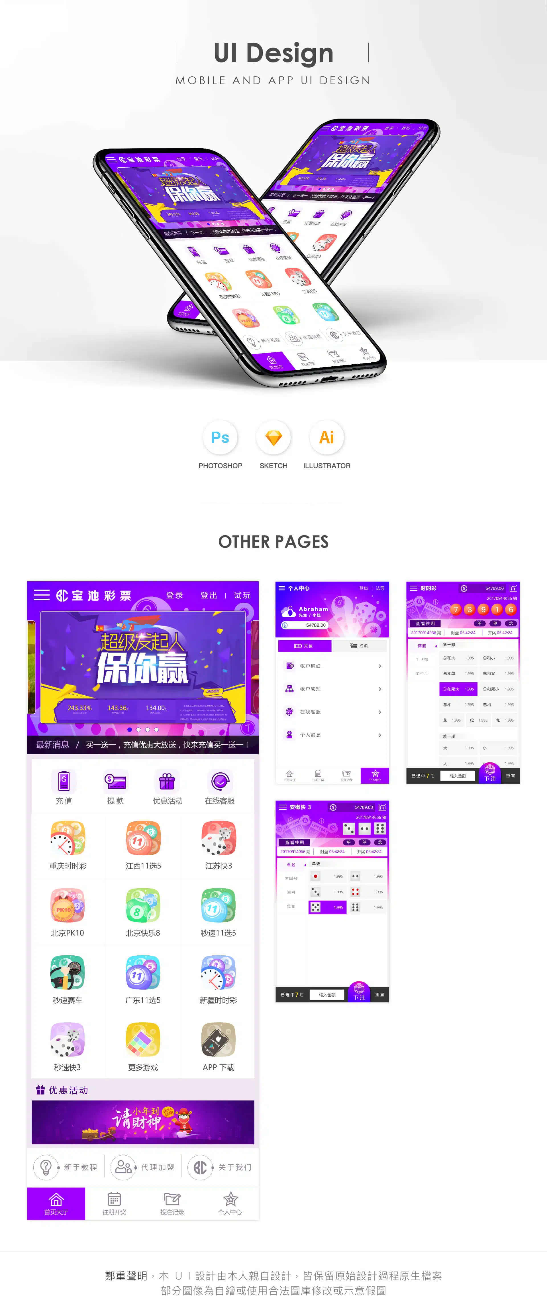
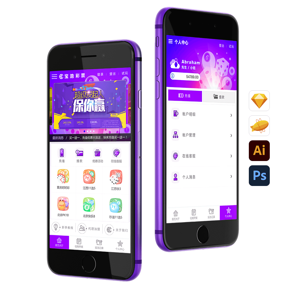
This mobile lottery UI design blends the glamorous purple and magenta tones commonly associated with casino and entertainment environments. These colors symbolize passion, energy, and luck, creating a vibrant and exciting gaming atmosphere. The depth of purple combined with the vividness of magenta enhances visual tension, allowing users to immediately feel a strong sense of impact and attraction when entering the interface.
Icon Design: The interface adopts a clean line-style icon system, which enhances the sense of simplicity and clarity while making interactions more intuitive. Circular lottery ball icons are used as key visual elements, symbolizing luck and opportunity. This aligns with the random nature of lottery games and helps strengthen the user’s sense of immersion during gameplay.
Overall Design Direction: The interface follows a minimalist approach, focusing on visual balance and usability. Unnecessary decorative elements are reduced so users can enjoy the game while maintaining a clear and intuitive interaction experience. High-resolution design files preserve more visual details, including refined icon design and subtle color gradients, allowing the interface to appear more polished and visually appealing on mobile screens.
Although this design is influenced by the overall product framework and shares similarities with certain visual styles, the carefully selected color combinations and refined icon arrangements help maintain its own distinct character. The result is a UI that delivers a gaming experience that feels both visually elegant and minimalist.