PortfolioUIUX Design
Game Interface APP
Project Summary
- Client Requirement: Create a design based on a minimalist style.
- Client Name: KING BAY TECH
- Project Scope: Game UI/UX Design
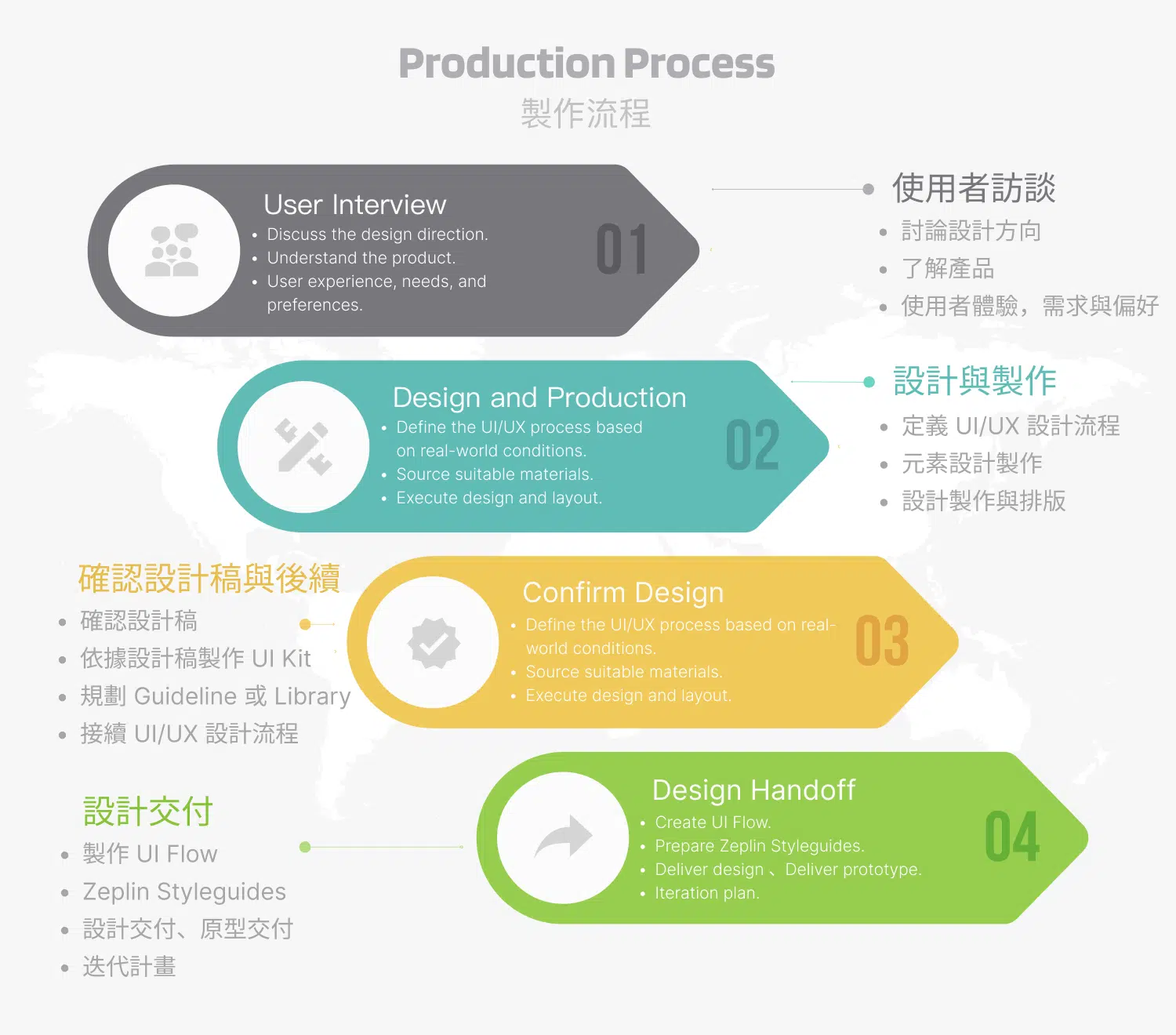
- Tools & Technologies: Sketch, Zeplin, Illustrator, Photoshop, DragonBones
- Note: According to the client, the game is licensed and released only in jurisdictions where gaming is legal. This project was produced as a contract development assignment, and the additional requirements were approved by the client.
Design Concept
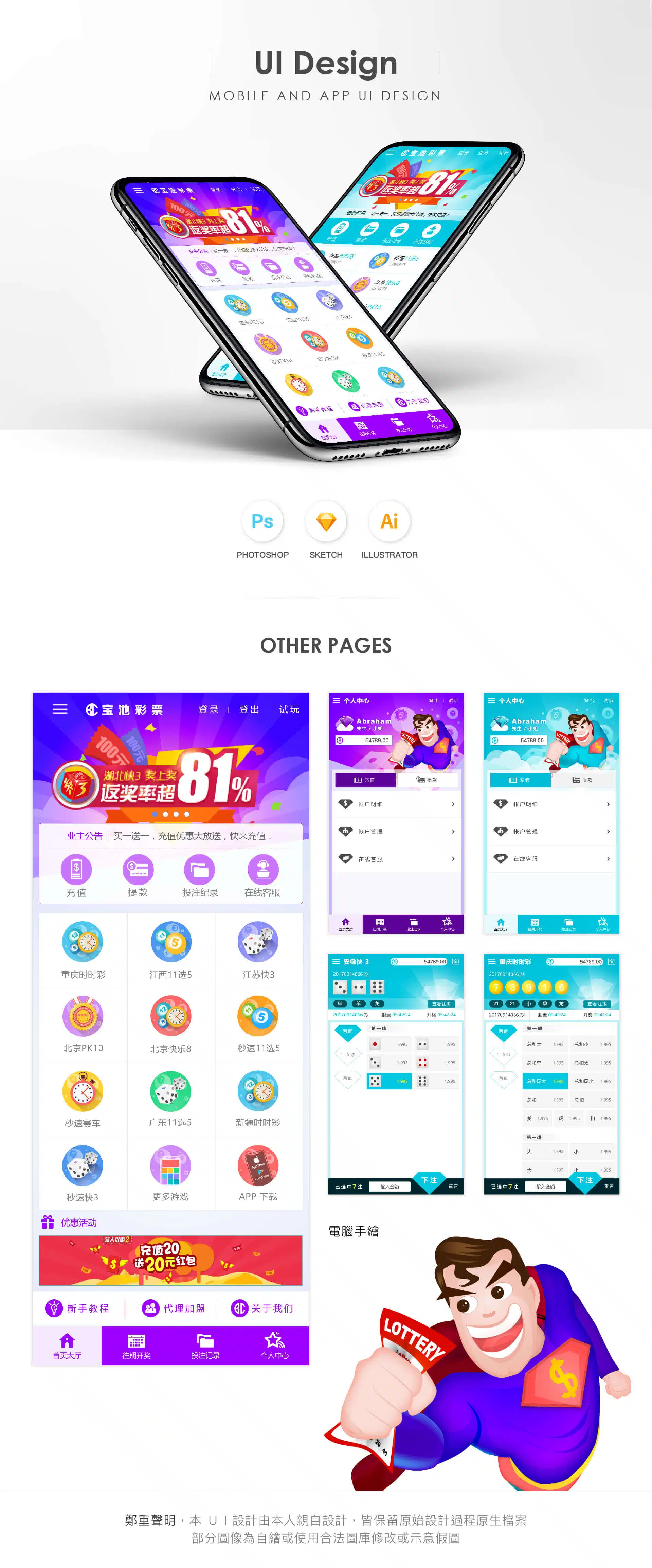
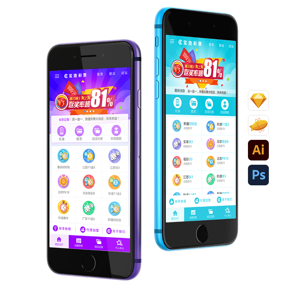
This mobile lottery UI design includes two different color schemes, aiming to provide a diverse visual experience and convey different emotional atmospheres depending on the gaming context.
The first design features a luxurious purple-blue color scheme, combined with vector-based icons and a superhero character illustration to convey the excitement and joy of winning. The depth and mystery of the purple-blue palette create a sense of luxury and sophistication, while the inclusion of the superhero figure reinforces the symbolism of victory. This visual approach allows users to feel a sense of “heroic” success and pride during interaction.
The second design adopts a turquoise-blue color scheme, paired with circular icons representing lottery balls to create a fresh and minimalist visual style. The circular icons appear lively, resembling bouncing lottery balls that symbolize randomness and excitement, making the interface feel more dynamic and engaging. The overall design follows a minimalist approach, ensuring users can navigate easily and stay focused on the core game functions.
In the original design files, both versions reveal additional visual details, including refined color gradients, more polished icon design, and carefully arranged layout elements. These details further enhance the overall quality and visual texture of the UI. Although influenced by the broader product framework, both designs maintain a clear brand style through their color choices and detailed composition, effectively creating an engaging user experience that aligns with the gaming theme.