PortfolioGraphic Design
Corporate Event Poster
Project Summary
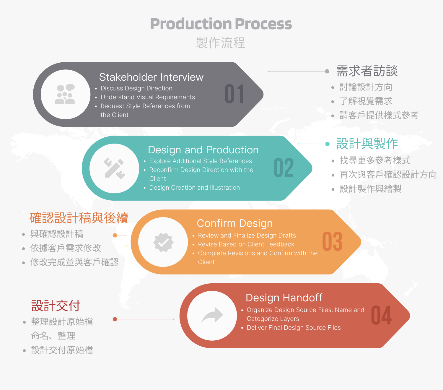
- Client Requirement: Logo Design
- Client: CENTRAL TRILLION INCORPORATION
- Project Scope: Logo Design
- Tools: Illustrator and Photoshop
- Note: The proposal was successfully approved by the client.
Design Concept
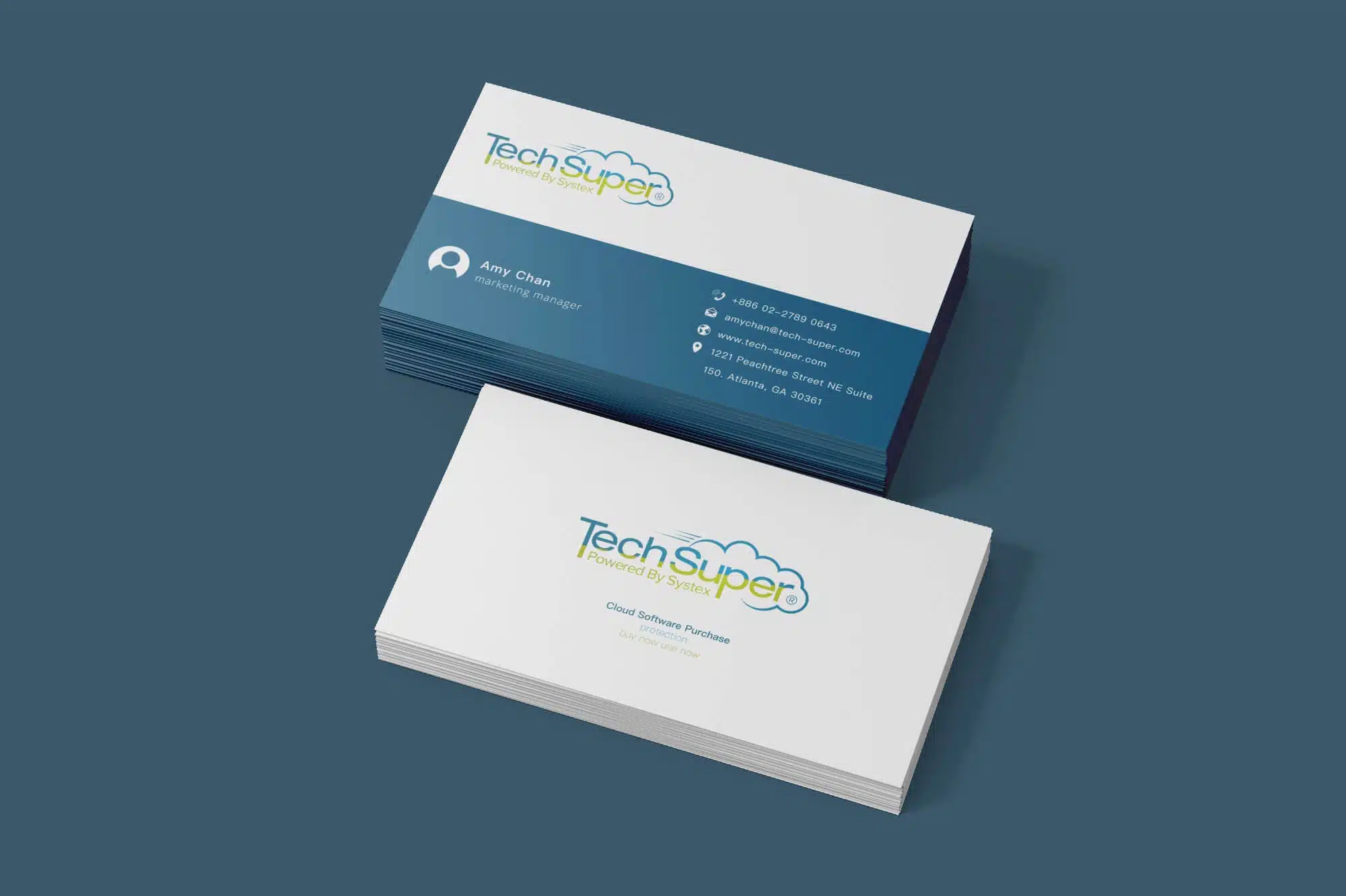
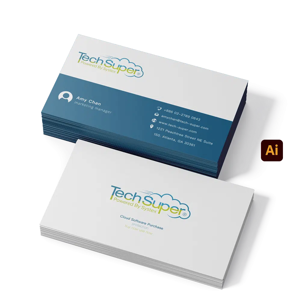
The visual design of this software e-commerce platform aims to convey a simple, efficient, and modern approach to purchasing and deploying digital software, while emphasizing the core value of improving business efficiency. Traditional software purchasing processes often involve managing multiple accounts and dealing with cumbersome physical packaging. In contrast, this platform is built around the concept of “one account, easy purchase, instant deployment,” enabling companies to manage and deploy software more conveniently, while delivering a smooth experience similar to the App Store.
Visual Design Details
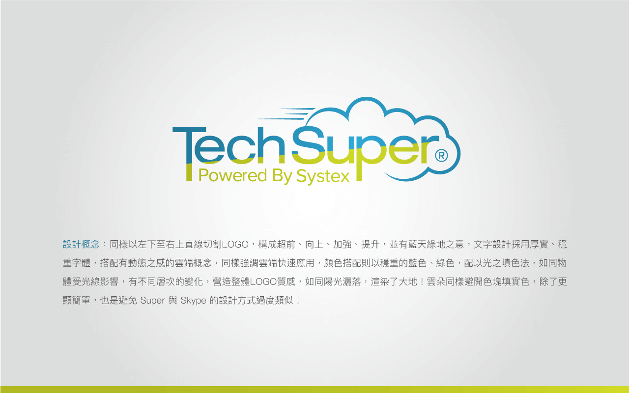
The logo design is based on two points. The line extending from the lower left to the upper right symbolizes progress, advancement, and enhancement, conveying a message of forward momentum and rapid growth. In contrast, the diagonal line running from the upper left to the lower right creates a sense of stability, forming a visual dynamic balance that further reinforces the concept of upward progression. The overall visual composition is slightly tilted (approximately 5 degrees), emphasizing speed and flexibility in application, while highlighting the platform’s efficiency and convenience.
Color Selection
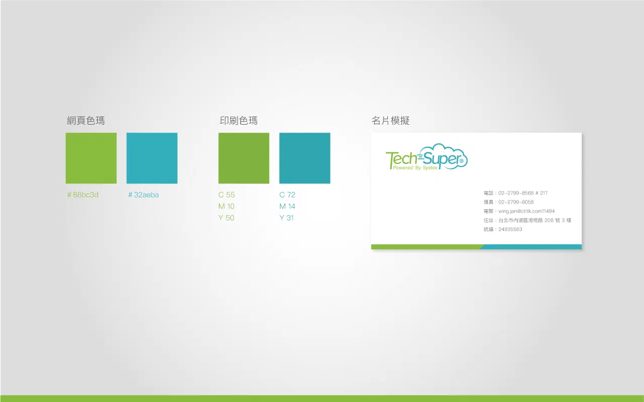
In terms of color selection, fresh grass green and blue are used to convey vitality and innovation, symbolizing freshness, new beginnings, and ease of use. The interplay of sunlight-inspired green tones and cloud-like hues enhances the visual energy of the overall design while avoiding excessive similarity with existing designs (such as Skype). This color combination not only makes the visual experience more lively, but also highlights the brand’s modern and refreshing character, allowing users to feel relaxed and pleasant while using the platform.
Overall, this design integrates a sense of dynamism, freshness, and efficiency, perfectly reflecting the client’s goal of creating a simple and fast software purchasing and management experience.