PortfolioOfficial Website
Web UI、Bootstrap
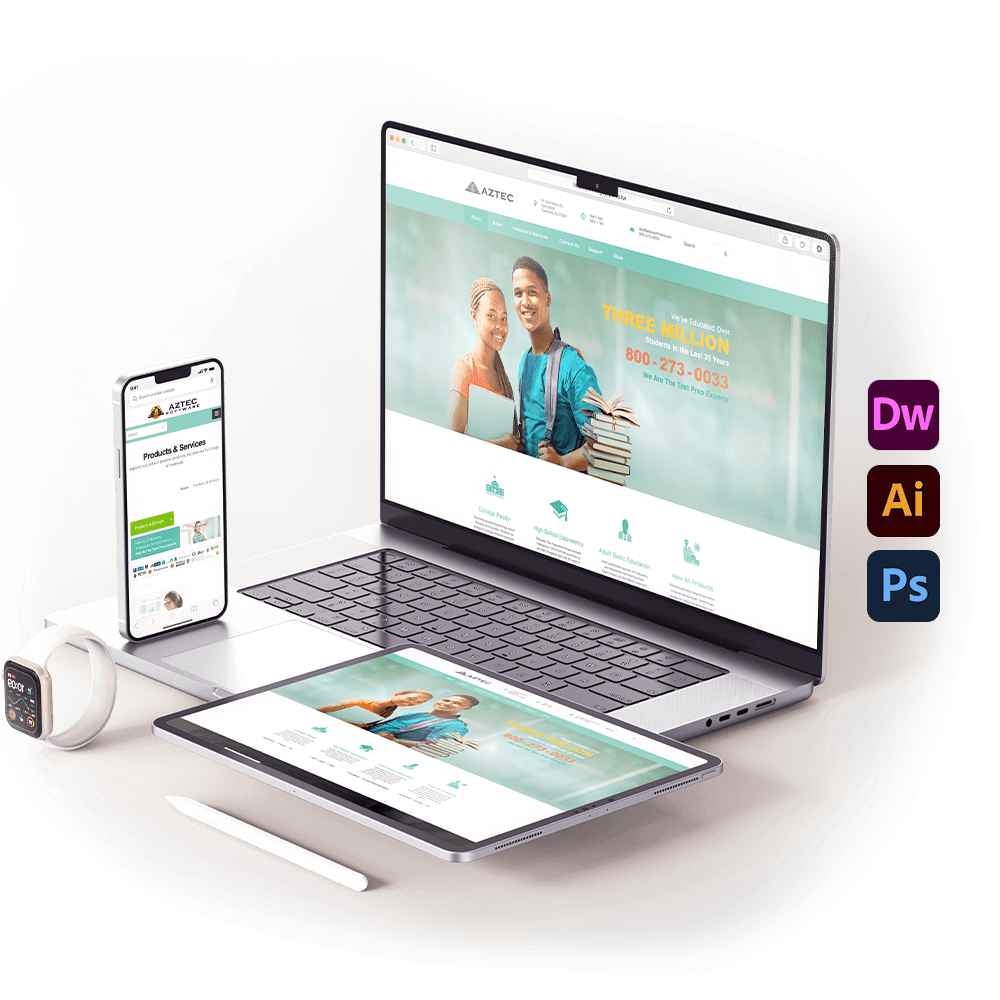
Project Summary
- Client Requirement: Redesign the traditional website into a responsive website. As this educational institution aims to avoid racial discrimination, imagery involving culturally sensitive or potentially offensive stereotypes should not be used.
- Client Name: AZTEC
- Deliverables: Official website UI design and HTML development
- Tools & Tech: Dreamweaver, Illustrator, Photoshop, and the Bootstrap framework
- Note: The current website may differ from the original design draft due to subsequent updates made by the client.
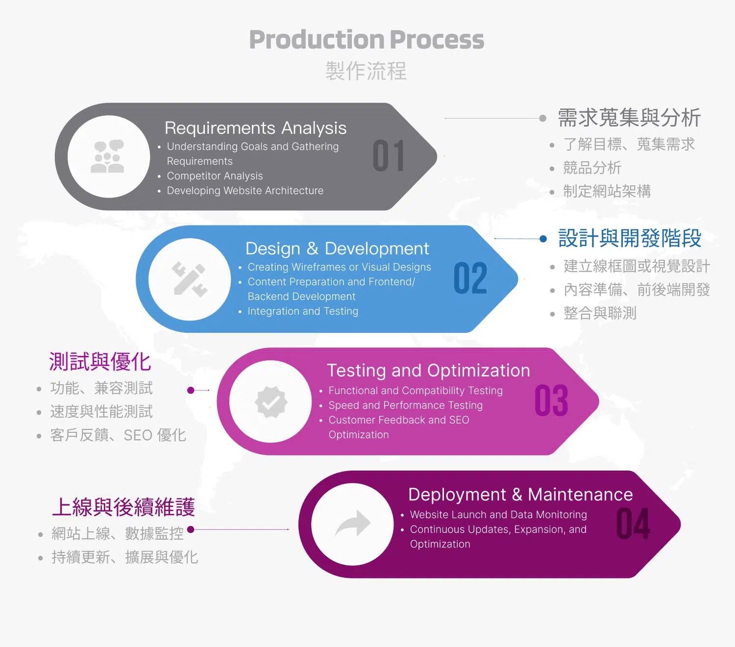
Design Concept:
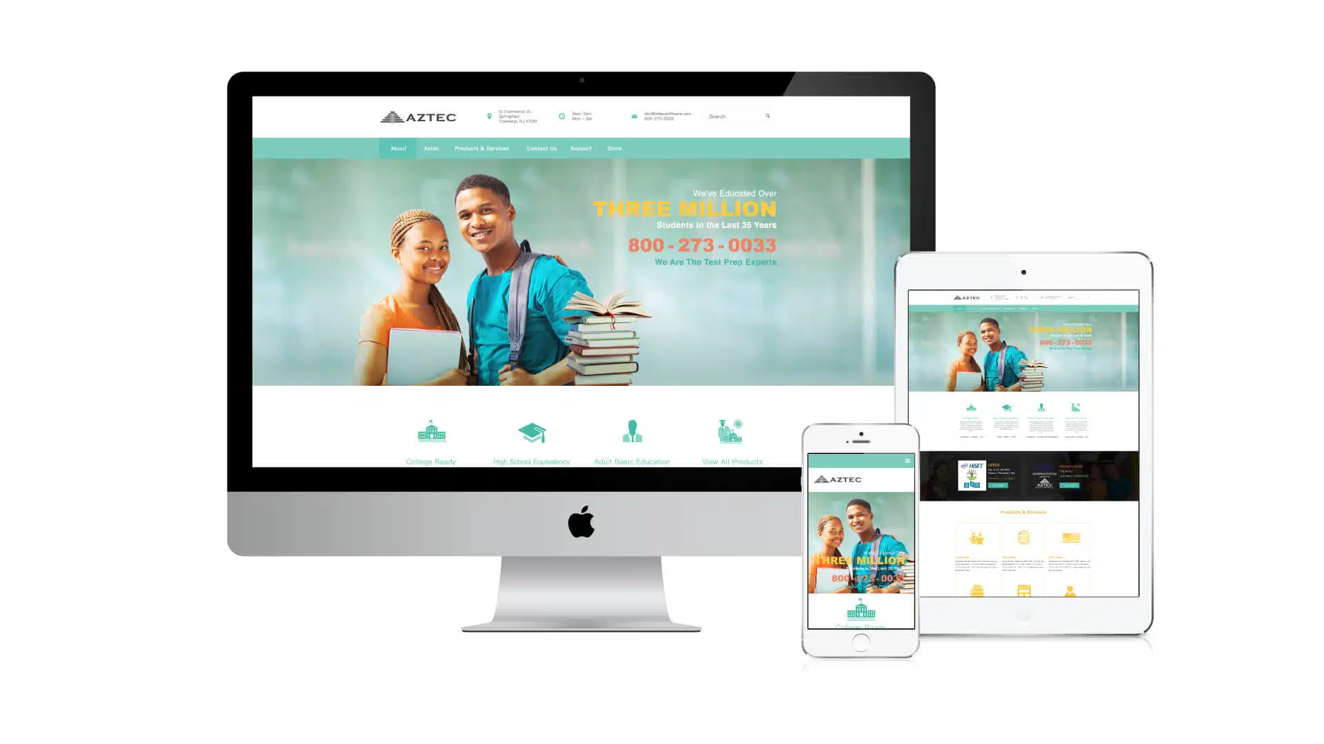
This design draft represents the original proposal prior to any client modifications. It was created for an adult education institution in the United States that primarily serves adults whose educational backgrounds are limited or whose academic qualifications do not meet standard requirements. The institution is dedicated to helping these individuals improve their skills and strengthen their competitiveness in the workplace.
The client provided a clear design guideline: to avoid using imagery of white individuals. This requirement stems from the organization’s strong awareness of racial sensitivity. Since many of the learners they support are people with darker skin tones, the use of white imagery could unintentionally create psychological pressure or lead to unnecessary comparisons and concerns. Therefore, the design carefully considers these sensitivities to ensure a respectful and supportive visual environment.
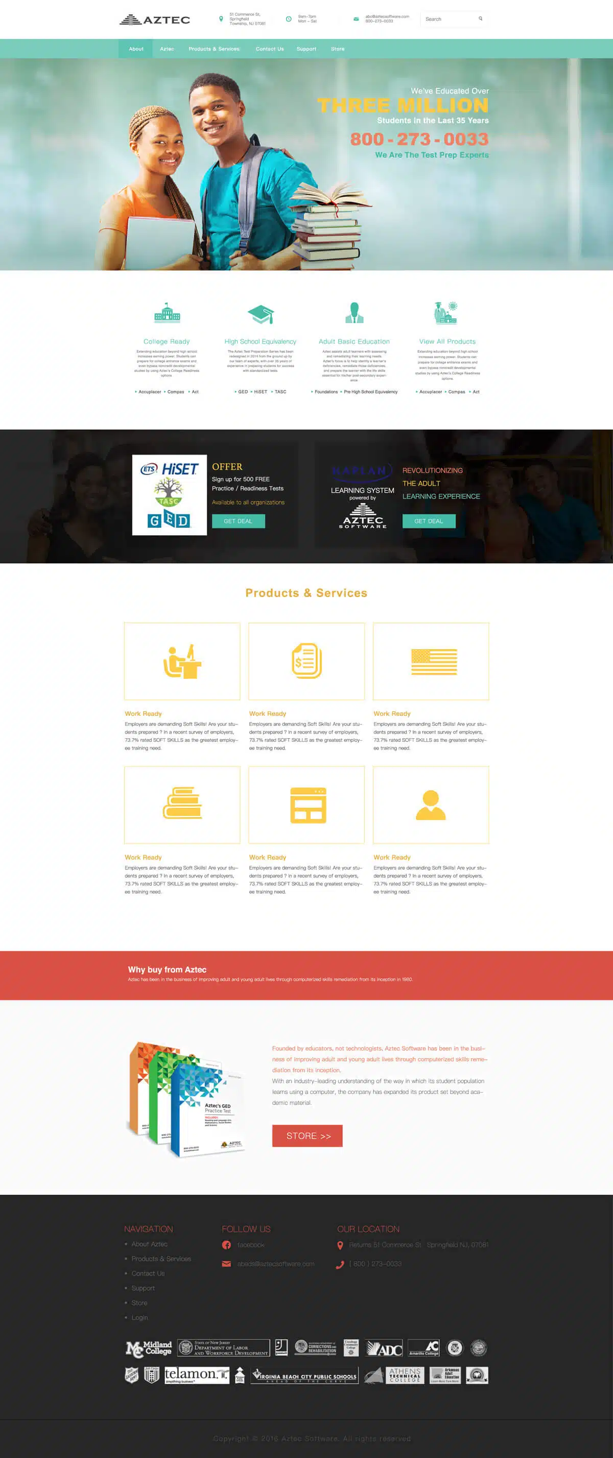
Version 1 Design
This version adopts a calm and gentle color palette to create a relaxed and peaceful visual atmosphere. The design aims to help learners feel that the learning environment is comfortable and pressure-free. By avoiding the overly serious style commonly seen in many educational institutions, the visual presentation becomes more approachable and inclusive.
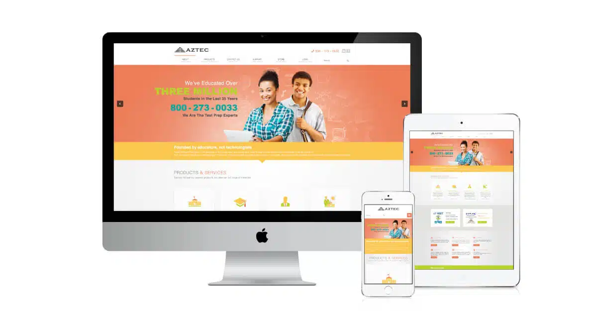
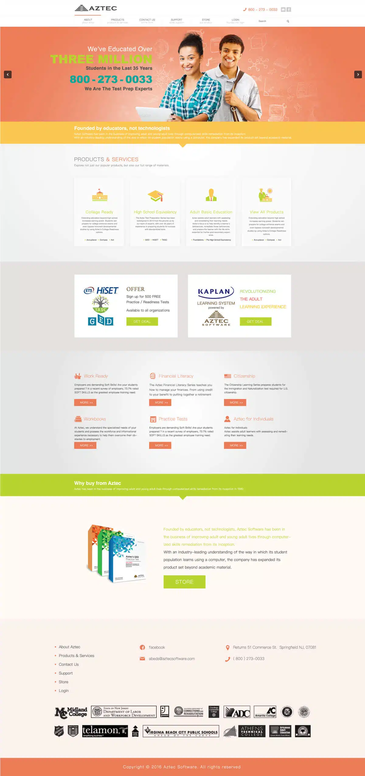
Version 2 Design
In the second version, a fresh and vibrant color palette was selected. Research suggests that individuals with darker skin tones often prefer brighter and more lively colors in clothing and visual expression. Therefore, the design incorporates vivid colors to create a warm and inviting atmosphere for potential learners.
This approach also avoids the solemn, rigid, or overly sharp visual styles commonly used by many educational institutions. The intention behind this design language is to communicate a welcoming message: “We hope you will feel completely at ease reaching out to us and beginning your learning journey.”
Both design versions place the psychological needs of learners at the center of the concept. Through thoughtful choices of color and visual style, the design aims to create a learning environment that feels inclusive, welcoming, and supportive.