PortfolioUIUX Design
Game Interface APP
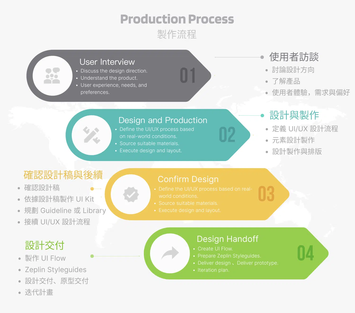
Project Summary
-
Client Requirement:
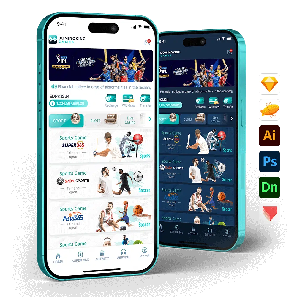
The client requested a sports-centered design approach to help create the international brand’s main homepage lobby and a dedicated sports homepage lobby. The goal is to highlight the brand’s identity and sports spirit while delivering a professional and visually engaging user experience. - Client: Paradise Game
- Deliverables: Iterative UI/UX design updates
- Tools & Technologies: Sketch, Zeplin, Illustrator, and Photoshop
- Note: According to the client, the game is licensed and released only in jurisdictions where gaming is legal. This project was produced as a contract development assignment, and the additional requirements were approved by the client.
Design Concept
- Adjust the UI layout of the “Game Options” from a vertical arrangement to a horizontal layout, providing additional space to accommodate languages with longer text such as English and Hindi.
- Maintain the vertical layout, while recommending that the client standardize the game option names using the internationally recognized language, English. This approach has been validated by competing products in the market and demonstrates both practicality and consistency.
In sports-related game design, the use of blue and teal carries strong color psychology significance. Blue represents trust, stability, and professionalism, allowing players to feel the reliability of the platform while conveying a calm and focused atmosphere that supports strategic thinking and decision-making during gameplay. Teal combines the steadiness of blue with the vitality of green, symbolizing balance, growth, and energy. It helps create a healthy and positive sports spirit while adding vitality and approachability to the overall design. The combination of these two colors not only aligns with the core values of sports gaming but also reinforces the brand’s professional and dynamic image.
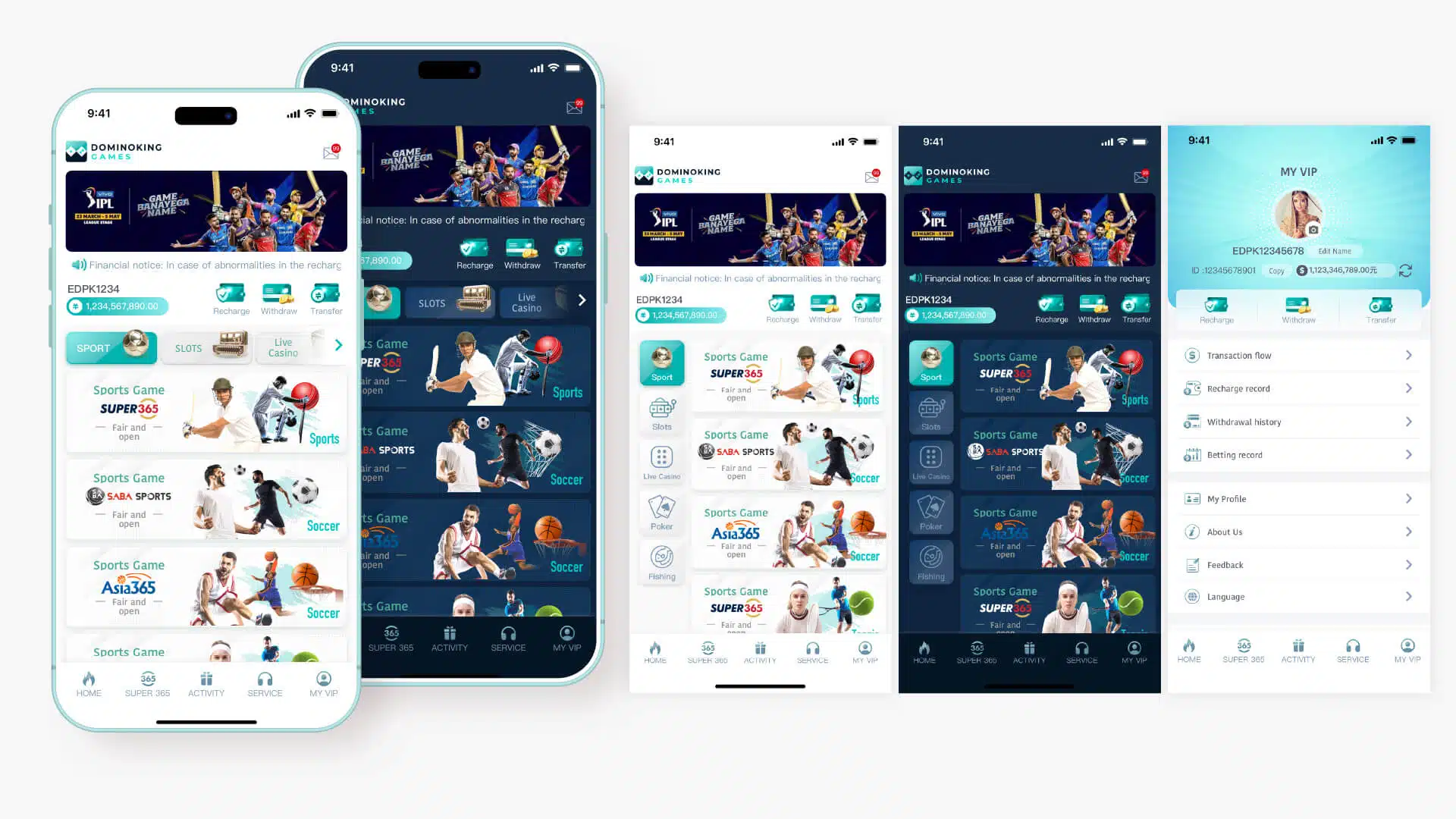
Other Pages:
Since the sports game module is embedded within the white-label gaming platform’s tab bar and serves as one of the client’s key highlight features, a consistent color scheme is recommended. This approach helps avoid the development complexity that may arise from maintaining multiple design guidelines, while also ensuring a unified brand identity and enhancing the product’s overall recognition and professional appearance.
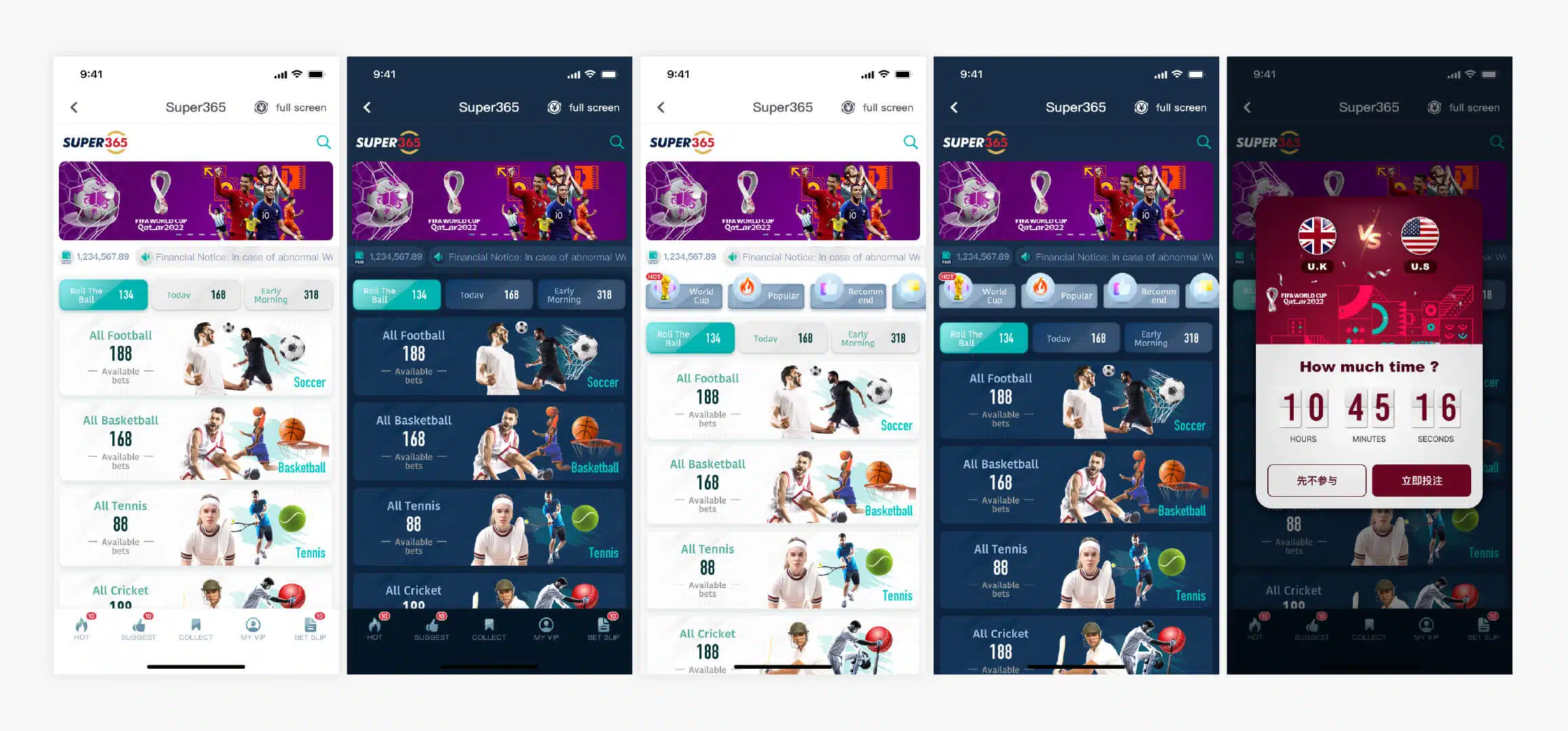
First Version:
The client initially requested to continue using the color scheme defined in the previous design guidelines, so the early design layout was developed based on that foundation. After several rounds of discussion, the client proposed new ideas for the design. Therefore, this version is presented solely to illustrate the evolution of the design process.
