PortfolioUIUX Design
Game Interface APP
Project Summary
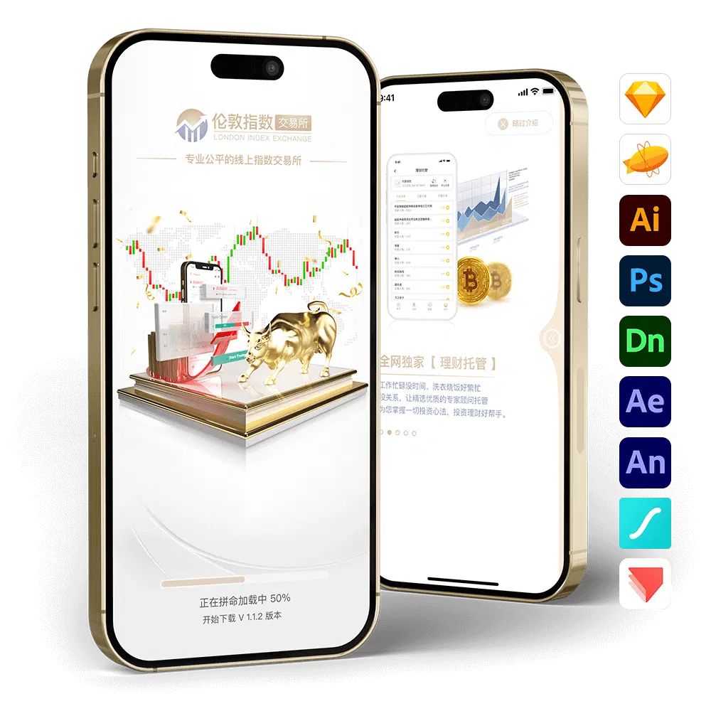
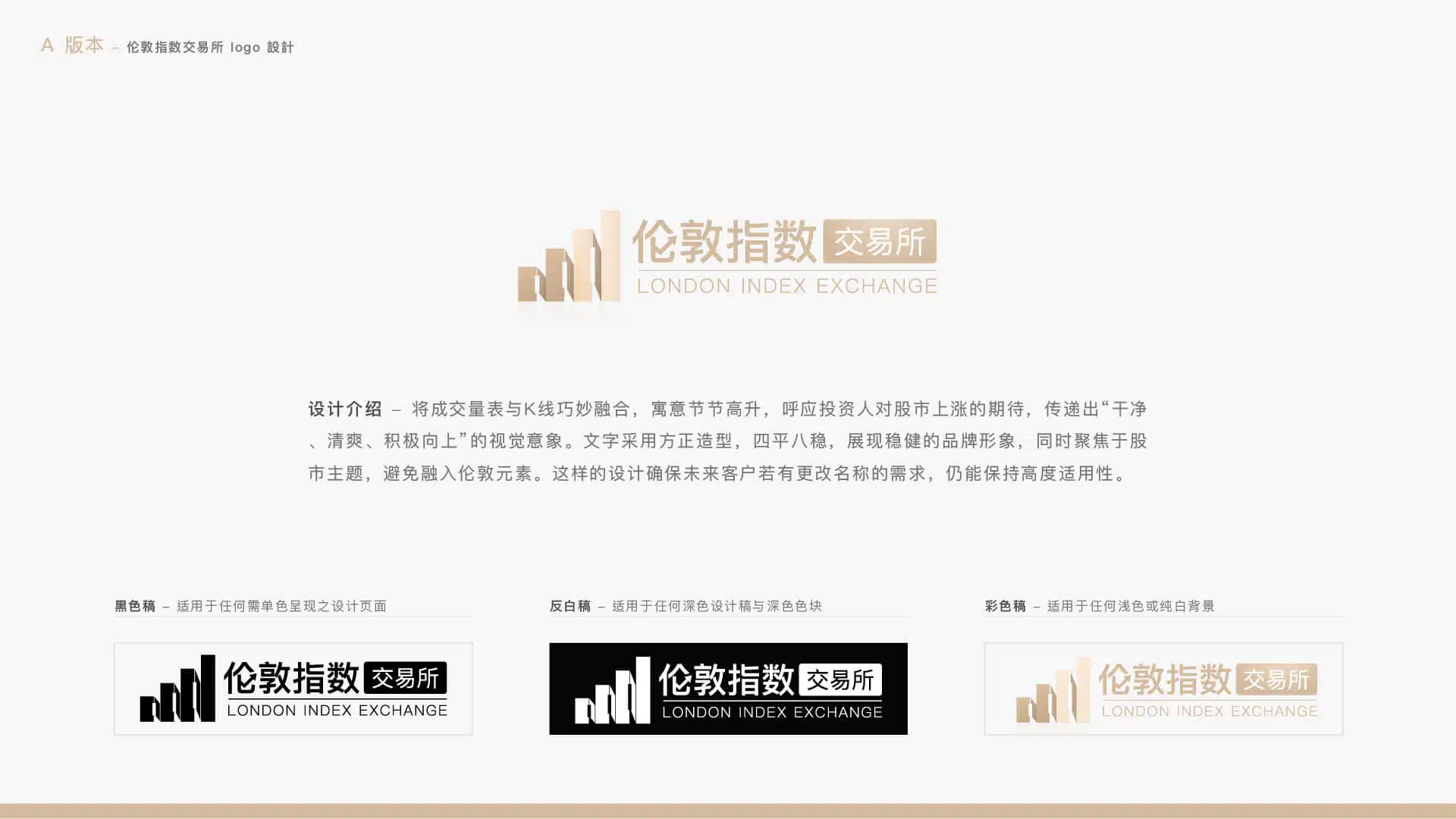
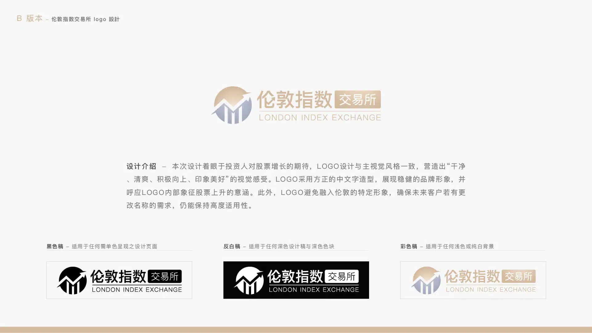
- Client Requirement: The client hopes to create a refined and refreshing design while incorporating more interactive animations to enhance the app’s brand recognition and overall visual quality. Although the design style is related to stock and financial themes, it is not directly tied to the brand name, allowing the product to remain highly adaptable if the product name changes in the future.
- Client: Paradise Game
- Project Scope: App copywriting, logo design, UI/UX design, animation production, 3D production, and prototype development.
- Production Tools: Sketch, Zeplin, Illustrator, Photoshop, Dimension 3D, After Effects, Animate, Lottie, ProtoPie
- Note: According to the client’s description, this game is licensed and released only in countries where gambling is legally permitted. The project was developed as an outsourced production. The design proposal was approved by the client and later developed into an app by their internal team.
Logo Design Concept – Version A
Logo Design Concept – Version B
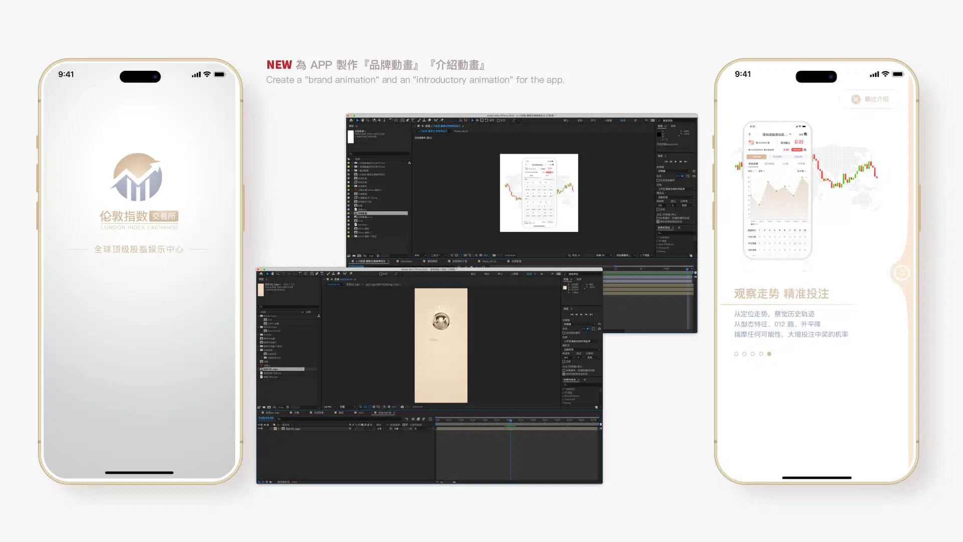
Opening Animation Design
Concept: “Refined into Gold”
In the UI/UX design of the app, incorporating a logo animation during the launch sequence can effectively enhance the user’s first impression. This short animation not only strengthens brand recognition but also communicates the brand’s core values and identity within just a few seconds, creating a sense of professionalism and high product quality. The dynamic presentation of the logo makes the visual experience more vivid, capturing users’ attention and establishing an emotional connection. Such a design creates a memorable opening experience while reinforcing brand recognition and reputation, helping users develop greater trust and anticipation toward the product.
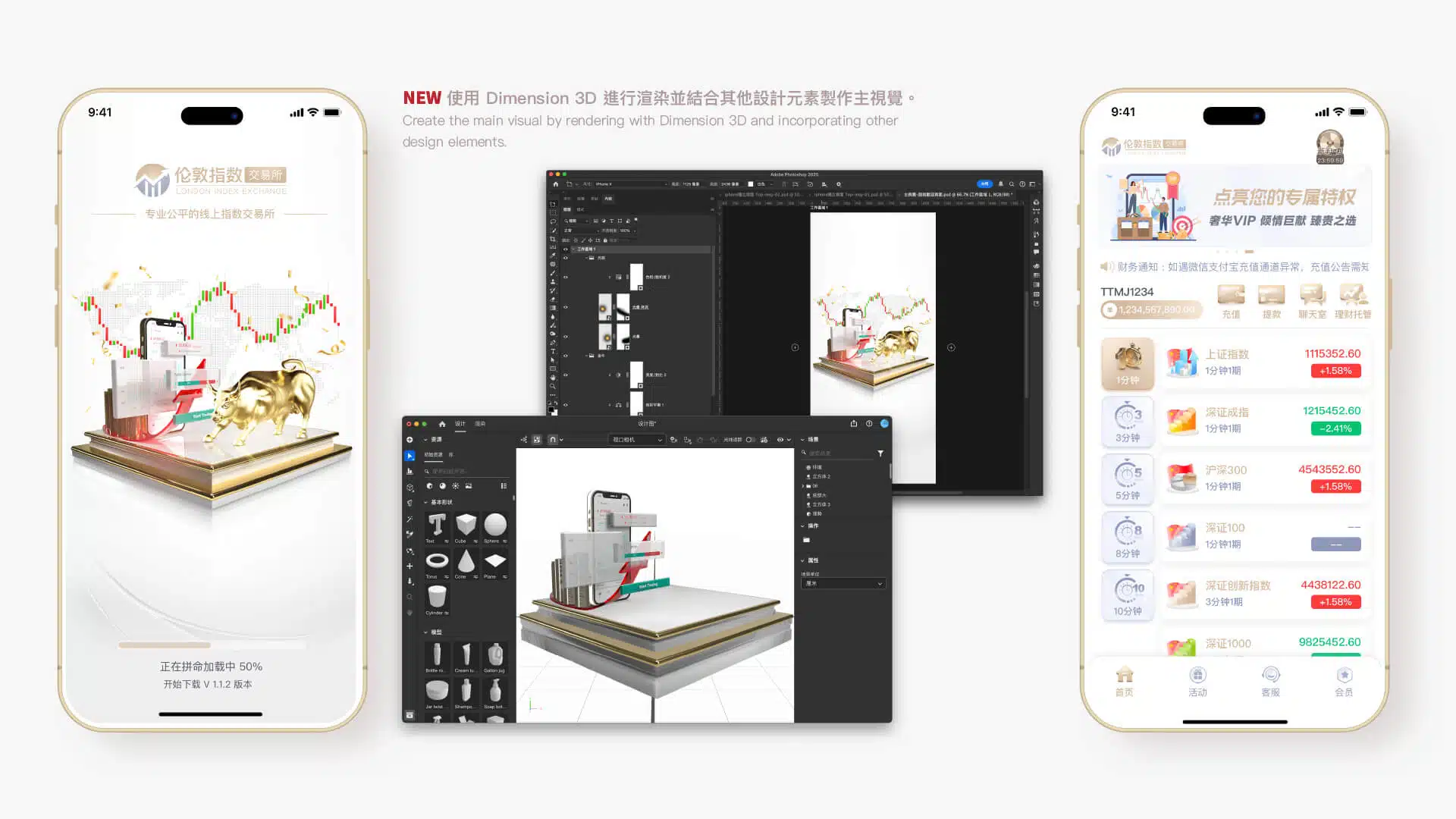
3D Key Visual Design
Using 3D technology to create key visuals offers several advantages. First, 3D design provides stronger depth and dimensionality, making visuals more vivid and attention-grabbing. Compared with traditional 2D design, 3D imagery can present richer details, enhancing the overall sense of layering and visual quality while reinforcing a premium and modern brand image. In addition, 3D design allows for greater interactivity, enabling more flexible visual engagement with users and leaving a lasting impression that strengthens brand recognition. Through 3D technology, key visuals not only increase the appeal of a product but also help a brand stand out in a highly competitive market, shaping a distinctive and future-oriented visual language.
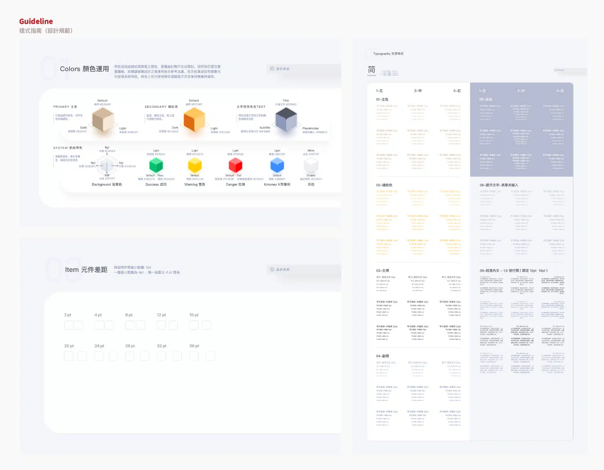
Guidelines
Creating a Guideline (design standard) plays a crucial role in the development of both a brand and its products. First, a guideline ensures consistency across design elements, including visual style, color usage, typography, and layout, allowing the brand to remain unified across different platforms and channels while strengthening brand recognition. Second, design standards improve team collaboration by providing clear references for designers, developers, and marketing teams, reducing repetitive work and potential errors while increasing overall efficiency. For future brand expansion or adjustments, a guideline also serves as a stable foundation, ensuring that the brand image remains consistent despite changes over time or within the team. In addition, establishing clear design standards helps present a more professional and trustworthy brand image, allowing users to experience a consistent sense of quality every time they interact with the brand.
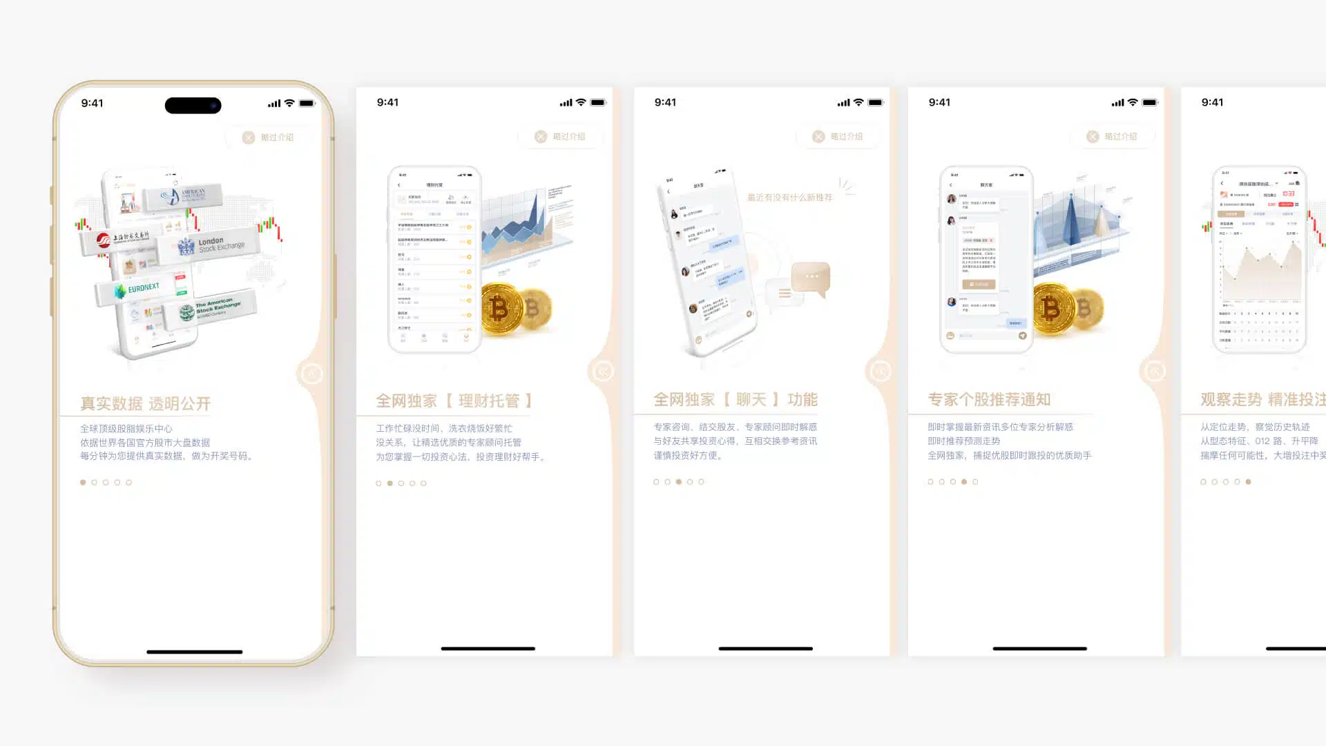
Feature Introduction Page Animation
Displayed only on the first launch of the app
In the UI/UX design of the app, presenting the introductory pages as animations when the app is first opened can significantly enhance the user’s initial experience. These animations capture users’ attention while creating smoother and more engaging visual transitions, allowing users to immediately perceive the app’s sense of modernity and professionalism. In addition, animated presentations can communicate the app’s core features and highlights in a more vivid way, helping users quickly understand the product’s value and how to use it, thereby shortening the learning curve. Through dynamic presentation, such onboarding pages increase user engagement and allow users to form a positive impression of the brand even before entering the main interface, while also raising anticipation toward the product. Ultimately, a well-designed animated introduction can improve user retention and usage rates, adding greater appeal to the overall product experience.
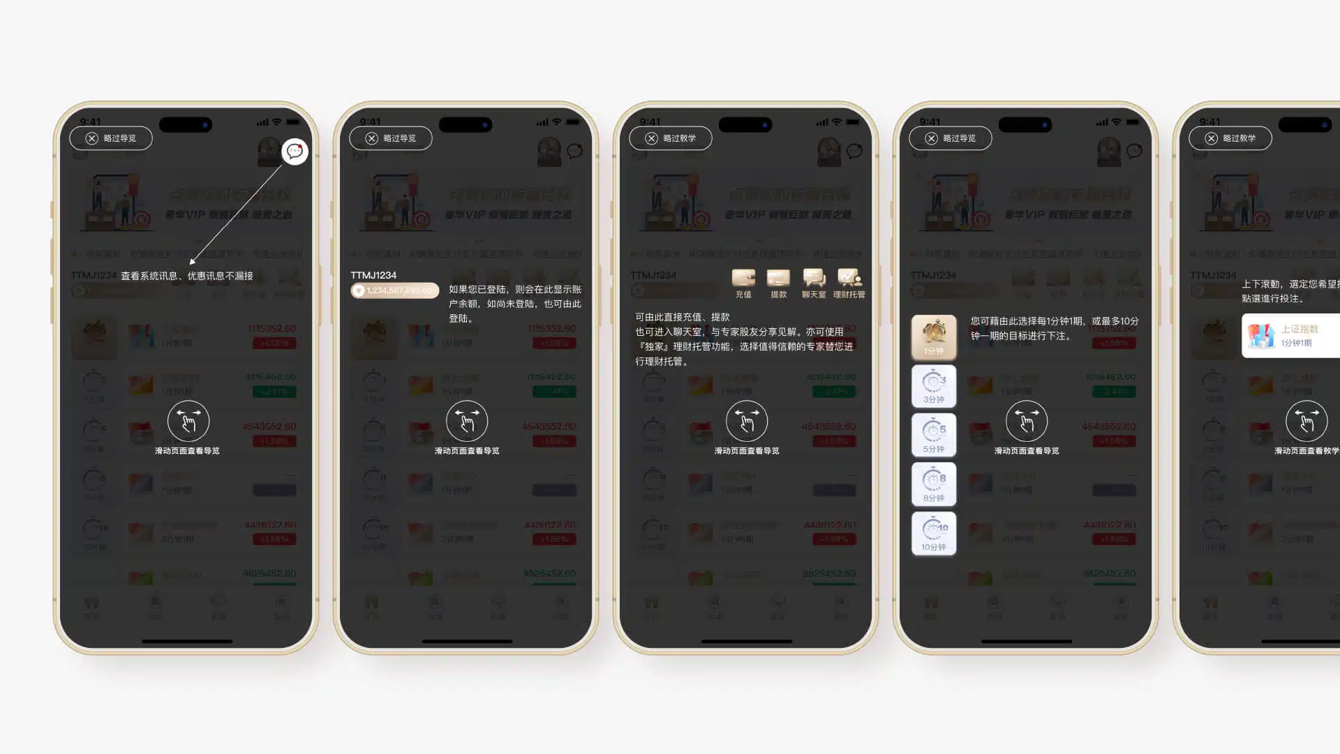
Feature Guide
Displayed only on the first launch of the app
In the UI/UX design of the app, providing feature guidance during the initial launch can significantly improve the user experience, especially for first-time users. These guides clearly introduce the app’s core functions and operation flow, helping users quickly get started while reducing the learning curve and preventing confusion or abandonment due to unfamiliarity. With clear and straightforward guidance, users can understand the app’s value in a short time and learn how to make full use of its features. In addition, feature guidance helps build user trust by making the app feel more approachable and easy to use, ultimately improving user satisfaction and retention. Such design not only enhances the overall user experience but also strengthens the brand image by demonstrating attention to detail and professionalism.
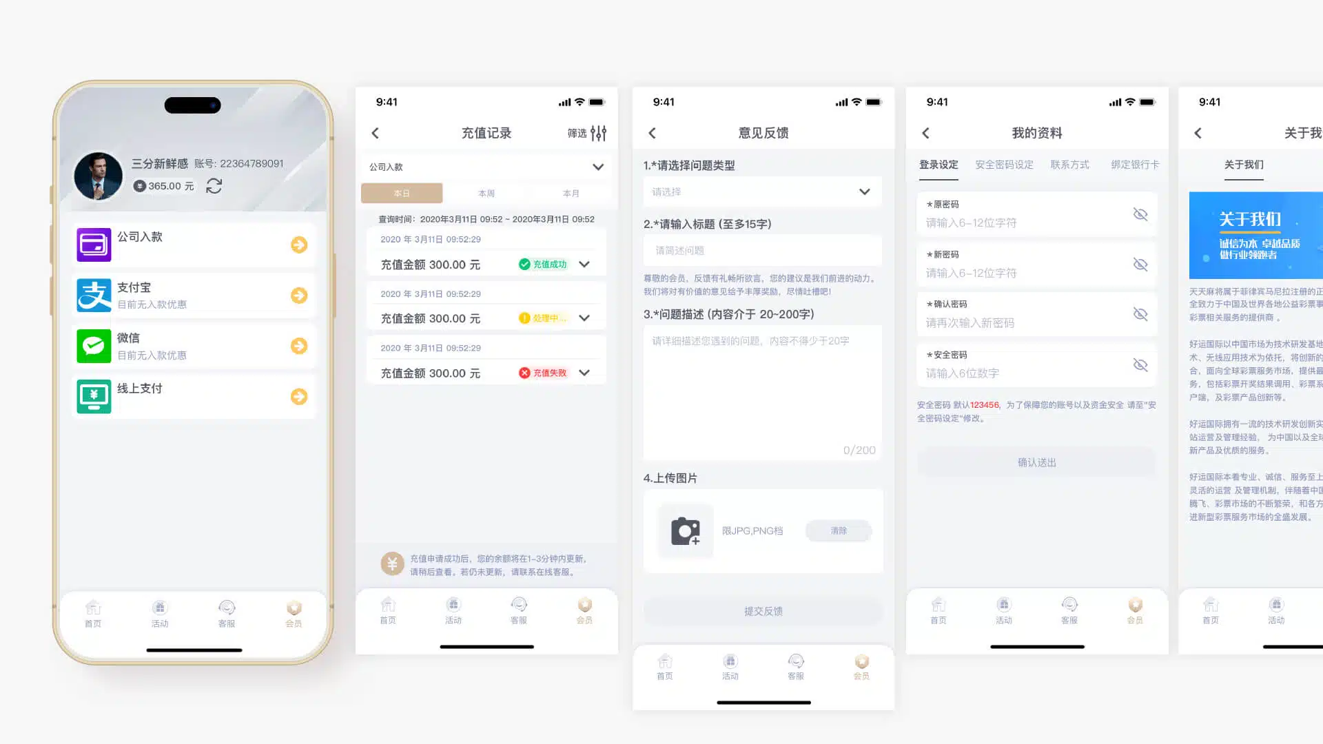
Other Pages
Special Feature: “Information” Page with Integrated Voice Reading
In the UI/UX design of the app, a voice reading function has been introduced to allow users to understand content by listening in certain situations, reducing the need to constantly look at the mobile screen. This feature is particularly useful when users are driving, walking, or in other situations where they need to stay aware of their surroundings. Users can listen to introductions and gameplay instructions, allowing them to grasp key information without distraction. The voice reading function not only improves convenience but also enhances safety, enabling users to enjoy the app’s features more flexibly in daily life while reducing the risk of accidents during movement. This thoughtful design reflects a strong focus on user needs, improving the overall experience and making the app feel more human-centered and intelligent.

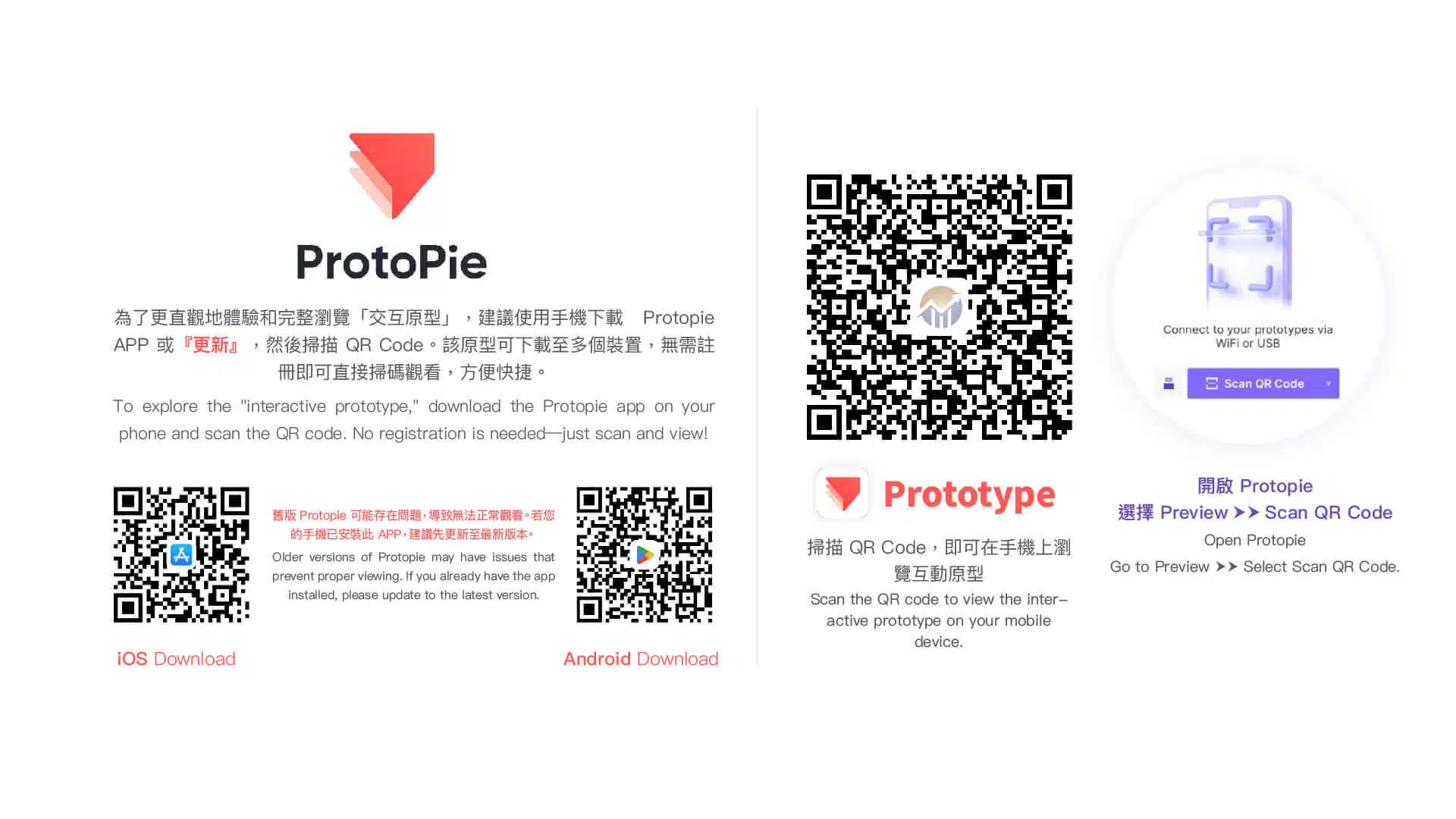
Embedded Interactive Prototype
It is recommended to download ProtoPie on your mobile device and scan the prototype QR code to experience the interactive prototype with direct touch interaction. An embedded version of the prototype is also available below, which can be operated using a mouse.