PortfolioGraphic Design
Corporate Event Poster

Project Summary
- Client Requirement: A people-centered approach with a warm and minimalist design style.
- Client: Kimyou Human Resources Agency
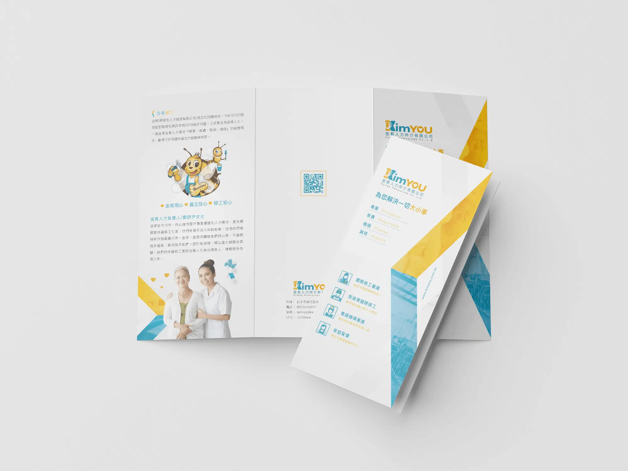
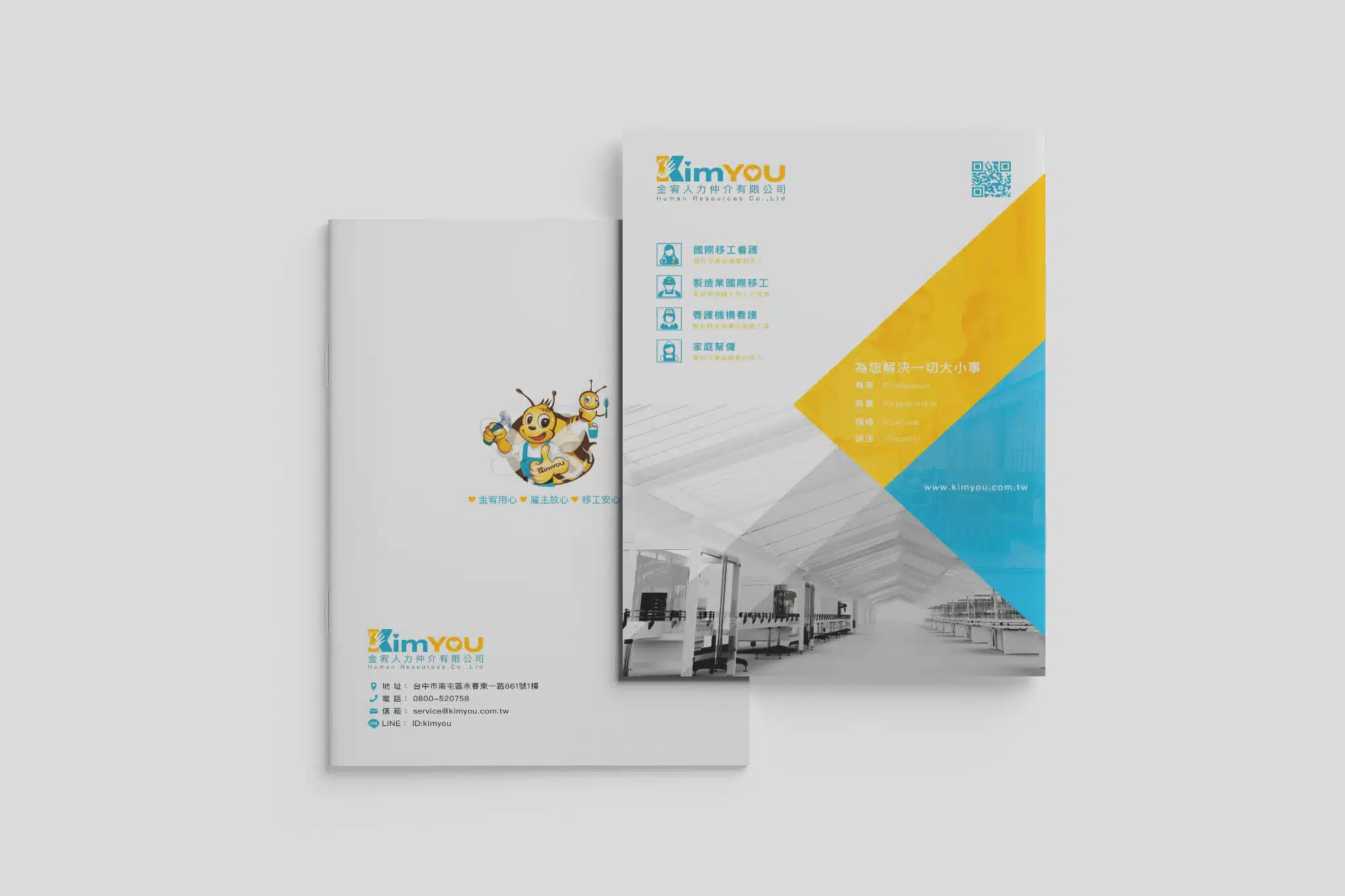
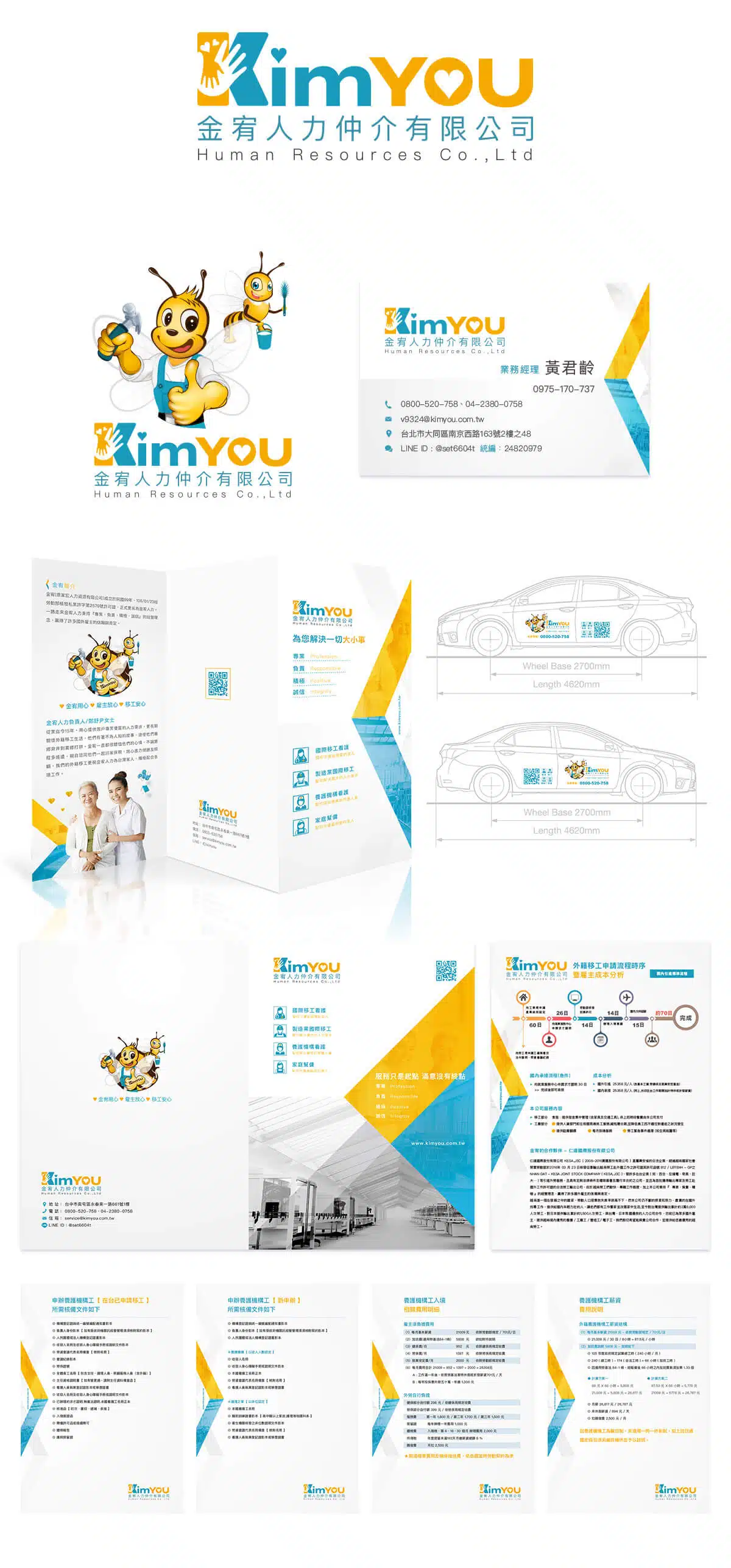
- Production Items: Logo Design, Corporate Mascot, Business Card Design, Vehicle Decal Design, DM Design, Folder Design, and Other Materials
- Tools: Illustrator and Photoshop
- Note: The proposal was successfully approved by the client.
Design Concept
LOGO Design
The logo design integrates the wordmark and graphic elements into a unified form, presenting a clean and vibrant visual identity that fully reflects the company’s core values. The typography is solid and stable, conveying a sense of reliability and trust.
Within the logo, the letter “i” in “Kim” incorporates a heart element, symbolizing care and warmth. The heart associated with “you,” together with the golden color accent, echoes the spirit of collaboration and connection. The most symbolic element is the shape formed by two hands, cleverly combined to represent mutual support, expressing the idea of “I” caring for and supporting “you.”
Corporate Mascot
The corporate mascot adopts the image of a golden bee, symbolizing diligence, hard work, and a spirit of cooperation. This concept aligns closely with the original idea of representing “hardworking ants” and “golden bees.” Since the red or black colors of ants do not visually harmonize well with gold, the golden bee became the most representative choice. Bees have long symbolized industriousness and efficient service, making them the most fitting representation of Kimyou Human Resources Agency’s brand identity.
The bee not only attracts the attention of audiences across different age groups in marketing and promotional materials, but its charming image also helps strengthen the brand’s memorability. Choosing a bee as the mascot allows the brand to stand out from competitors in the market, preventing visual confusion and ensuring a clear and recognizable brand identity for customers.
In addition, the golden bee mascot can be extended into future marketing activities, such as promotions involving honey-related products. By collaborating with high-quality beekeeping producers and placing the Kimyou Human Resources Agency brand on honey products, the company can strengthen its healthy brand image while increasing market exposure.